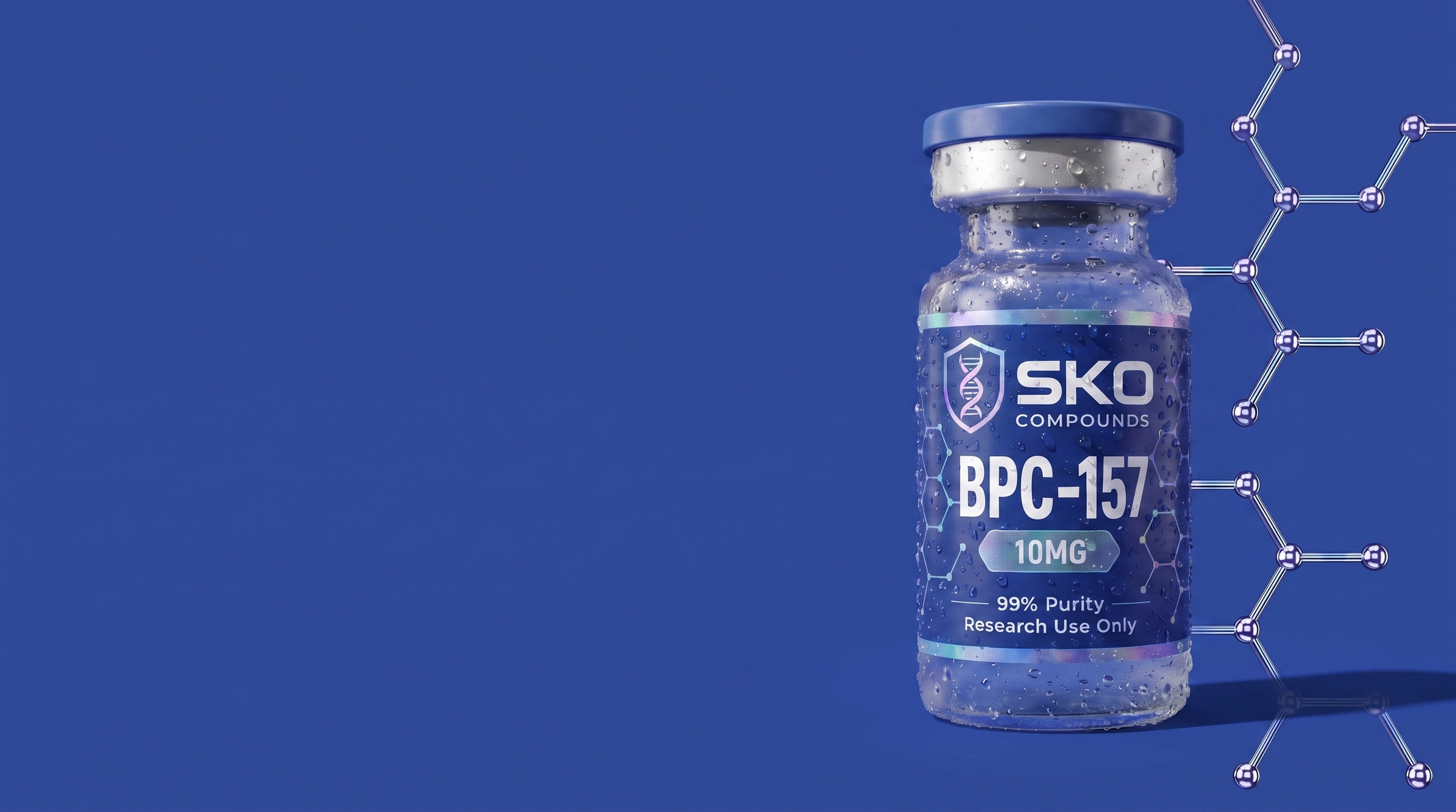
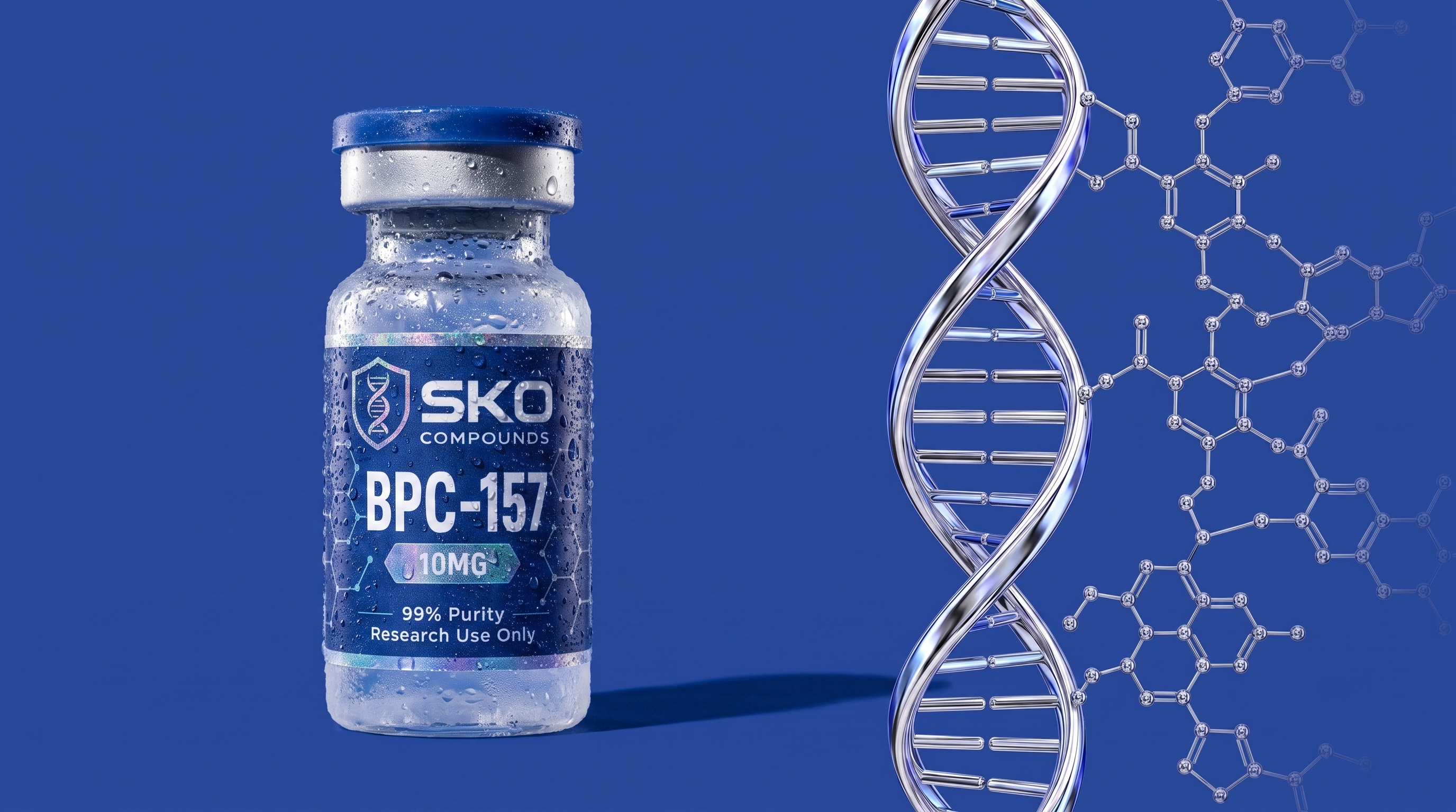
That is the brand. Navy label, chrome band, wet glass, the liquid behind it. Everything SKO puts into the world is that object or a consequence of it, and this book is built in that order.
Three roles, three materials. The ground is Field blue: flat, edge to edge, nothing behind it. The structure is chrome: the helix and the compound, one machined material. The subject is the bottle, the only thing that is ever photographed. Nothing else gets a material.
Power, not playfulness. Clinical, exact, expensive. Nothing soft, nothing warm, nothing cute. If a frame could belong to a sports drink, it does not belong to SKO.
Every page that follows is one of the three roles. Anything that was not is in the archive.
 STRUCTURE · CHROME
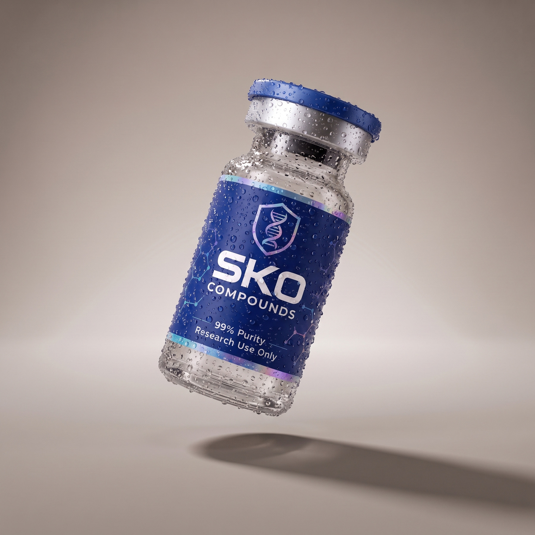 SUBJECT · THE BOTTLE
 SKO BRAND BOOKTHE IDEA
The label is the logo. The shield and the wordmark exist because they are printed on the bottle; off the bottle they are used exactly as they appear on it. Three shapes, and the names matter because the filename is what the next person trusts.
3×1 is the horizontal lockup — shield left, wordmark right. It is the default wherever there is width for it.
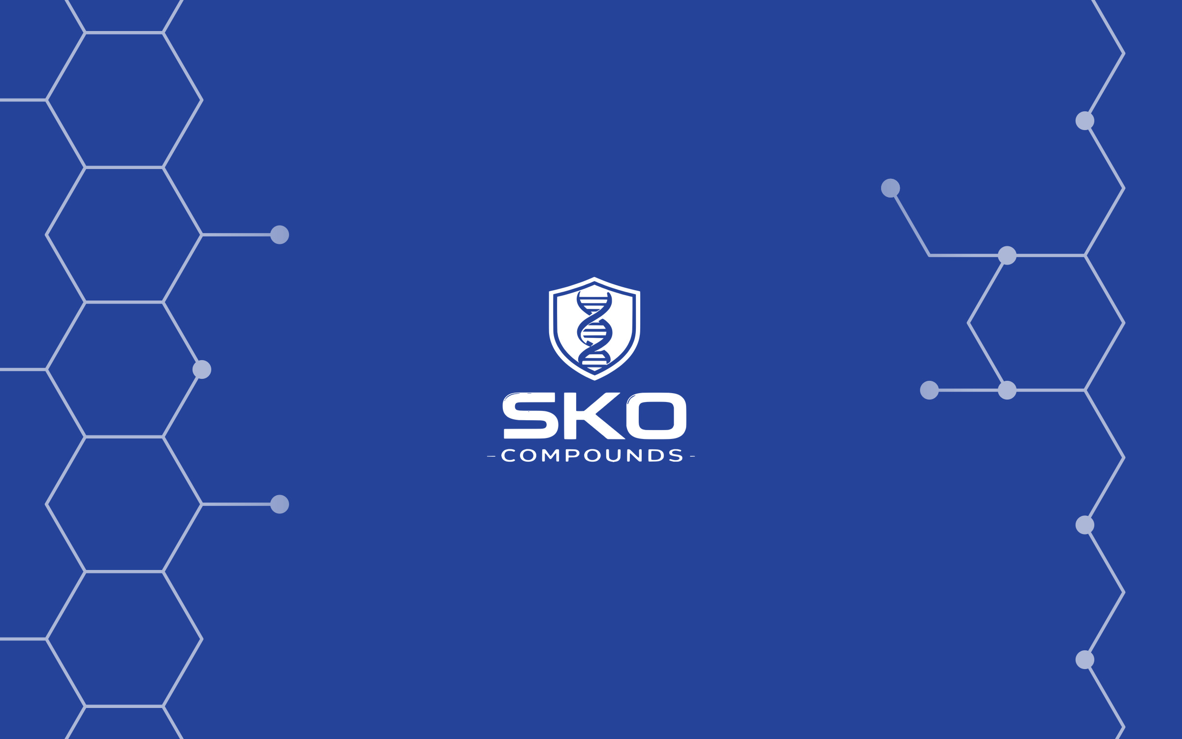
1×1 is the stacked lockup — shield on top, SKO COMPOUNDS beneath. Roughly square. This is the app icon and the avatar.
SHIELD is the mark on its own, taller than wide. It is not the 1×1 — the 1×1 still carries the wordmark.
Clear space on all four sides equals the height of the shield. White on coloured grounds and photography, navy on light. Disclaimers always take the flat white shield.
Below roughly 48 px, and over any image, drop to a flat shield. The full‑colour lockup is a render and does not survive either.
 3×1 LOCKUP · NAVY ON LIGHT
 3×1 LOCKUP · WHITE ON BLUE
 1×1 LOCKUP · WHITE ON BLUE · SHIELD ON TOP
 1×1 LOCKUP · NAVY ON LIGHT
 FLAT WHITE · DISCLAIMERS
 FLAT BLUE · #173384
 FLAT DEEP · #092266SKO BRAND BOOKIDENTITY
Two cuts, and they are not interchangeable.
PLAIN is the solid silhouette — no helix, nothing inside it. It is the badge: reach for it to contain something, to sit over a photograph, or anywhere the mark would be too busy to read.
MARK is the shield with the helix knocked out. Because the helix is a hole, it takes the colour of whatever is behind it — which is right on a flat ground and wrong on a busy one. On a photograph, use PLAIN.
Both are one colour, cut from the vector: no gradient, no bevel. White for coloured grounds and every disclaimer; blue and deep for light grounds.
Below roughly 48 px, and over any image, these are the only cuts. The full‑colour mark is a render and does not survive either.
 PLAIN WHITE
 PLAIN BLUE · #173384
 PLAIN DEEP · #092266MARK WHITEMARK BLUE · #173384MARK DEEP · #092266
 128
128
 64
64
 32
SKO BRAND BOOKIDENTITY
32
SKO BRAND BOOKIDENTITYOne blue at three values. SKO Blue is the primary, measured off the label. Field is the same blue held brighter — what blue becomes when blue is the whole surface. Foil is a material, not a colour: two bands on the label, and it appears only where it physically exists.
The blue is already Yves Klein Blue. IKB is #002FA7, hue 223. SKO Blue is #173384, hue 224 — the same hue, ours darker. Nothing to chase. But Klein’s blue was never a backdrop, it was the work, and that is the rule we take.
Measured 29 Aug 2026 off the label artwork. #26379B, #1B2A7A and the store’s #1447D6 were read off photographs, not the pack, and are retired.
| HEX | #173384 |
| RGB | 23 51 132 |
| USE | Primary |
| HEX | #092266 |
| RGB | 9 34 102 |
| USE | Ground |
| HEX | #244399 |
| RGB | 36 67 153 |
| USE | Flat field |
| HEX | #9DBFD9 |
| RGB | 157 191 217 |
| USE | Secondary |
| HEX | #F4F5F7 |
| RGB | 244 245 247 |
| USE | Surface |
| TYPE | Material |
| USE | Seal / edge |
| RULE | Only where real |
SKO BRAND BOOKIDENTITYTwo faces. DM Sans does the talking, Inter does the work, and nothing else is added without replacing one of them.
Both load from Google, so what this page shows is what ships — there is no licensed file to chase before artwork can be approved.
Labels are uppercase at 0.18em. Nothing else is uppercase. Set tabular figures wherever numbers line up in a column.
Manrope stays in exactly one place — the Machine Vision readouts, because that is the face the overlay system renders its labels in. It is not a brand face.
| ROLE | FACE | SIZE | LINE | WEIGHT | TRACKING |
|---|---|---|---|---|---|
| Display | DM Sans | 72 | 0.94 | 700 | −0.038 |
| Section title | DM Sans | 34 | 1.05 | 500 | −0.020 |
| Lead | Inter | 18 | 1.55 | 400 | −0.005 |
| Body | Inter | 15 | 1.60 | 400 | 0 |
| Caption | Inter | 12 | 1.45 | 500 | 0 |
| Label | Inter | 10 | 1.20 | 500 | 0.180 |
SKO BRAND BOOKIDENTITYThe connective asset, and it is one material: polished liquid chrome with thin‑film iridescence, the same physics as the foil on the label. It is never line art and it is never a glyph. What is on the page is a machined object standing in the Field.
The geometry stays honest. Strands are offset 0.42 of a turn, not half, which is what gives B‑DNA its wide major groove and narrow minor one. Two and a half turns at this radius; tighter reads as a spring.
It joins the compound. Where the helix meets the label’s molecular linework the two are the same chrome, bond for bond, and the linework fades into the blue. One material, two forms: the helix is the structure, the compound is what it is made of.
Seven cuts, one geometry. All seven are rendered off the same reference. Three are material — chrome, soft white, matte blue — and three are flat for print, small sizes and embroidery. The seventh is the mark’s own ombré.
CLICK ANY PLATE TO DOWNLOAD






 SKO BRAND BOOKSTRUCTURE
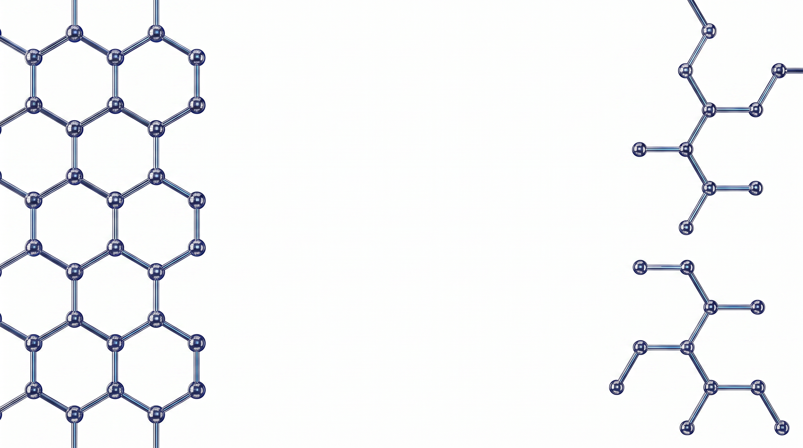
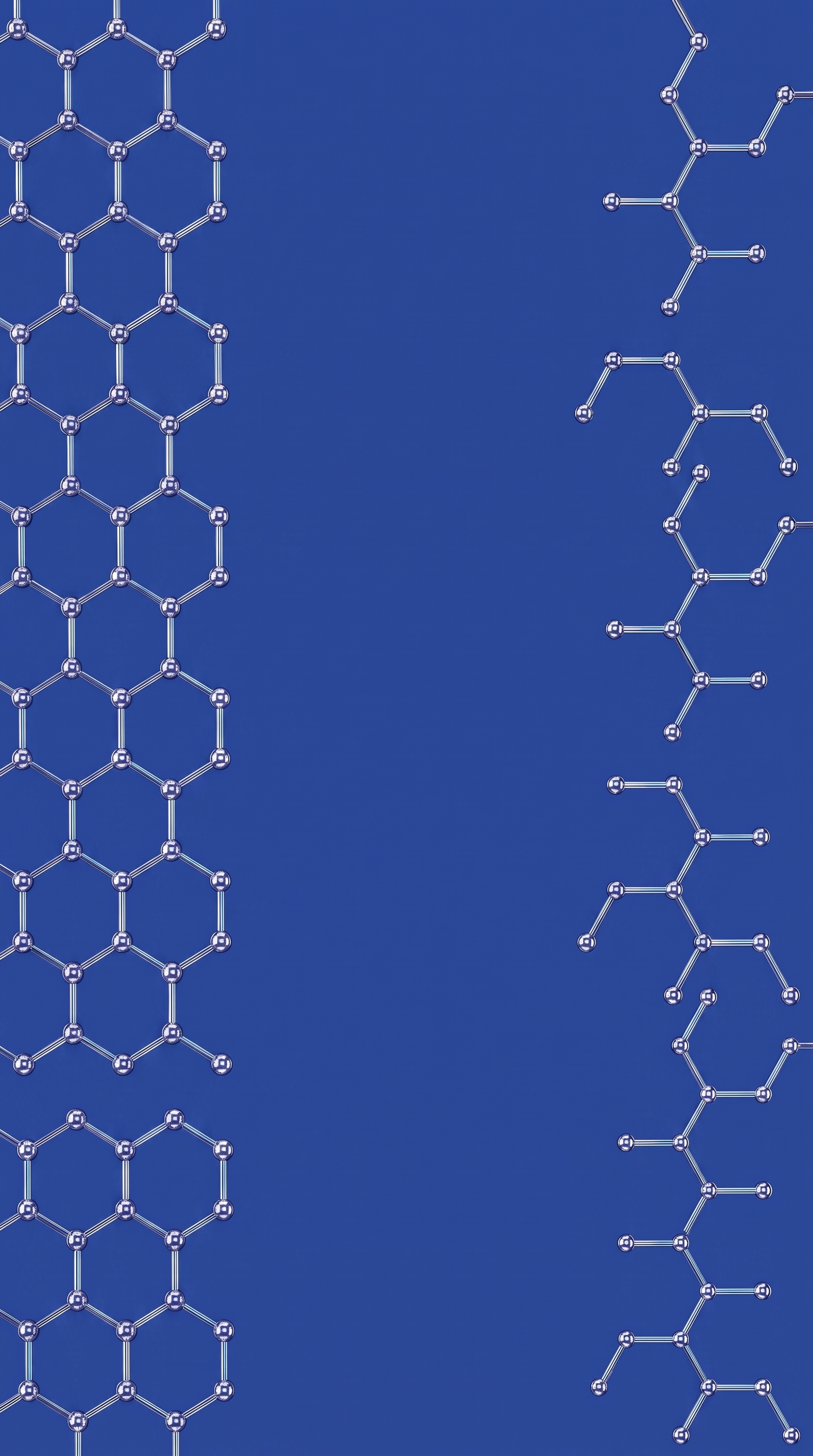
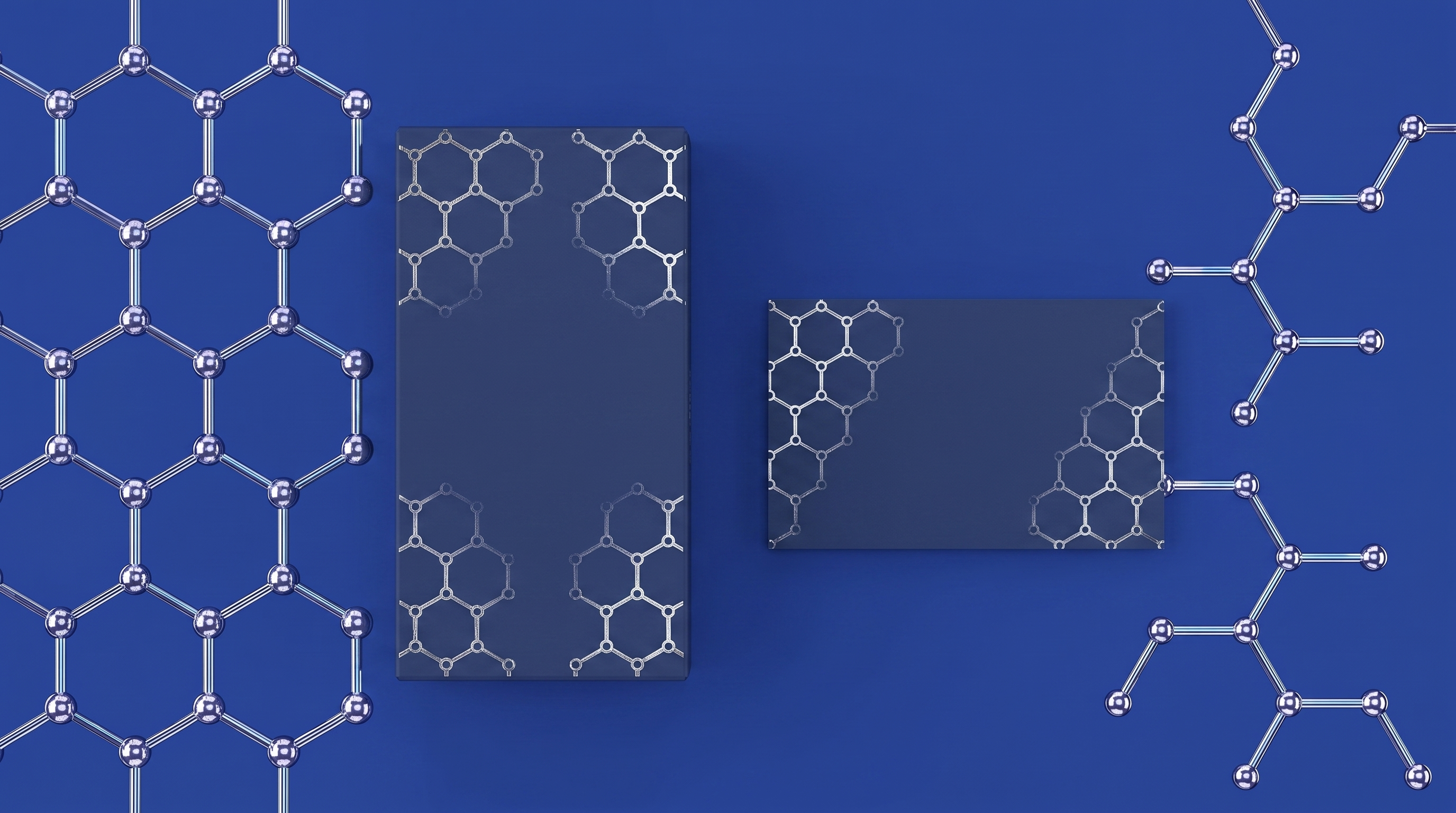
The linework on the label is a molecule. A column of fused rings up one edge, a branching chain with its atoms down the other, both fading toward the centre so the type sits on clear ground. On the pack it is foil. Rendered, it is liquid chrome — the same material as the helix.
It lives at the edge. The compound frames a composition; it never fills one. There is no honeycomb cut, and there will not be one. Two fragments at the margins, fading in, and never behind type.
Four grounds. Field is the default. Deep for dark work, Halo for light, and white for print and paper. The chrome is the same in all four; only the ground changes, so the reflections change with it.
Three frames. 16:9, 9:16 and 1:1, each composed for its shape rather than cropped from the wide one. In print it runs as a foil deboss along the edges of the box and the card.
CLICK ANY PLATE TO DOWNLOAD
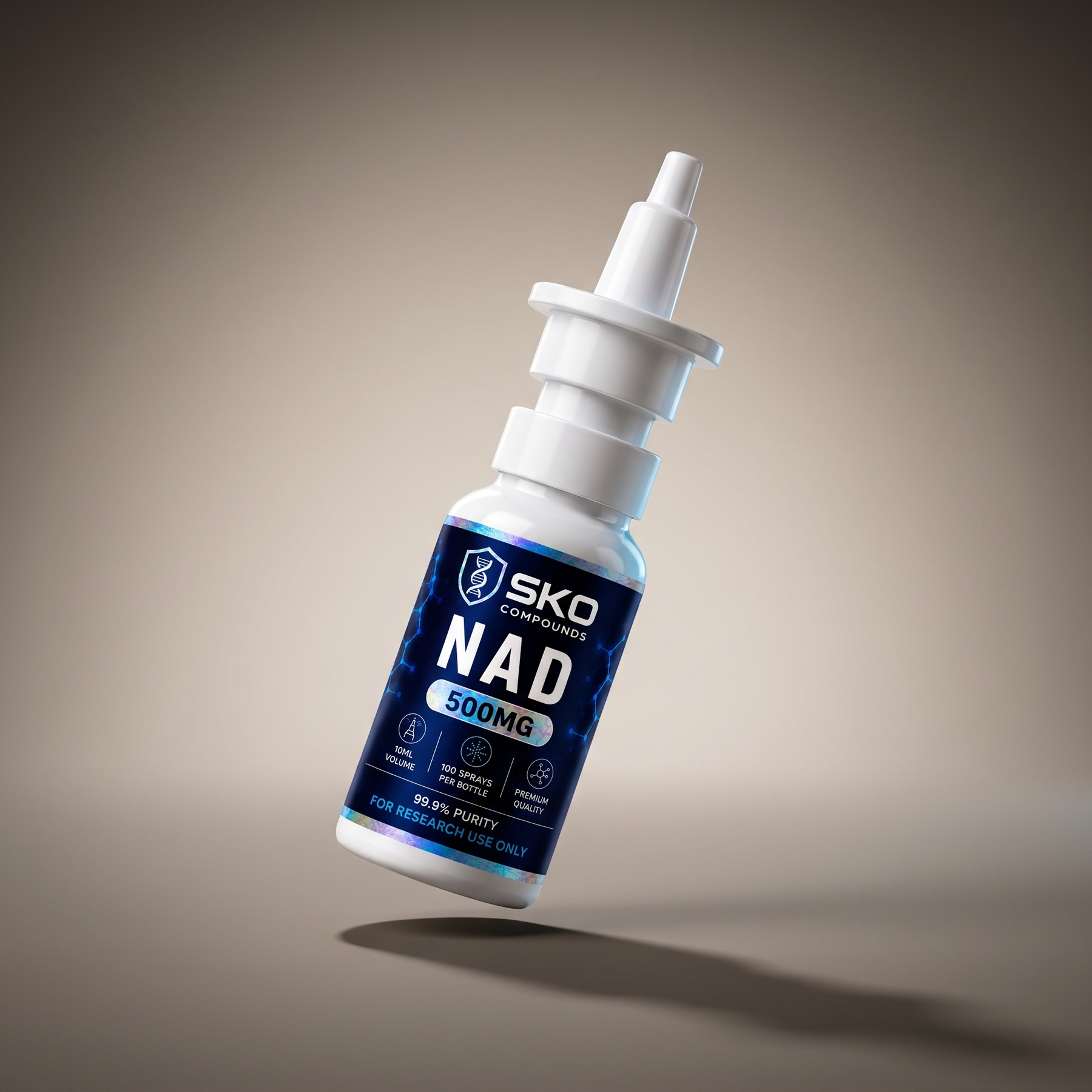
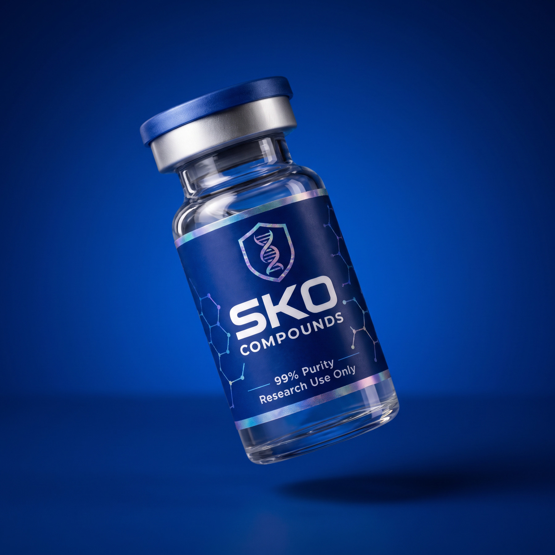
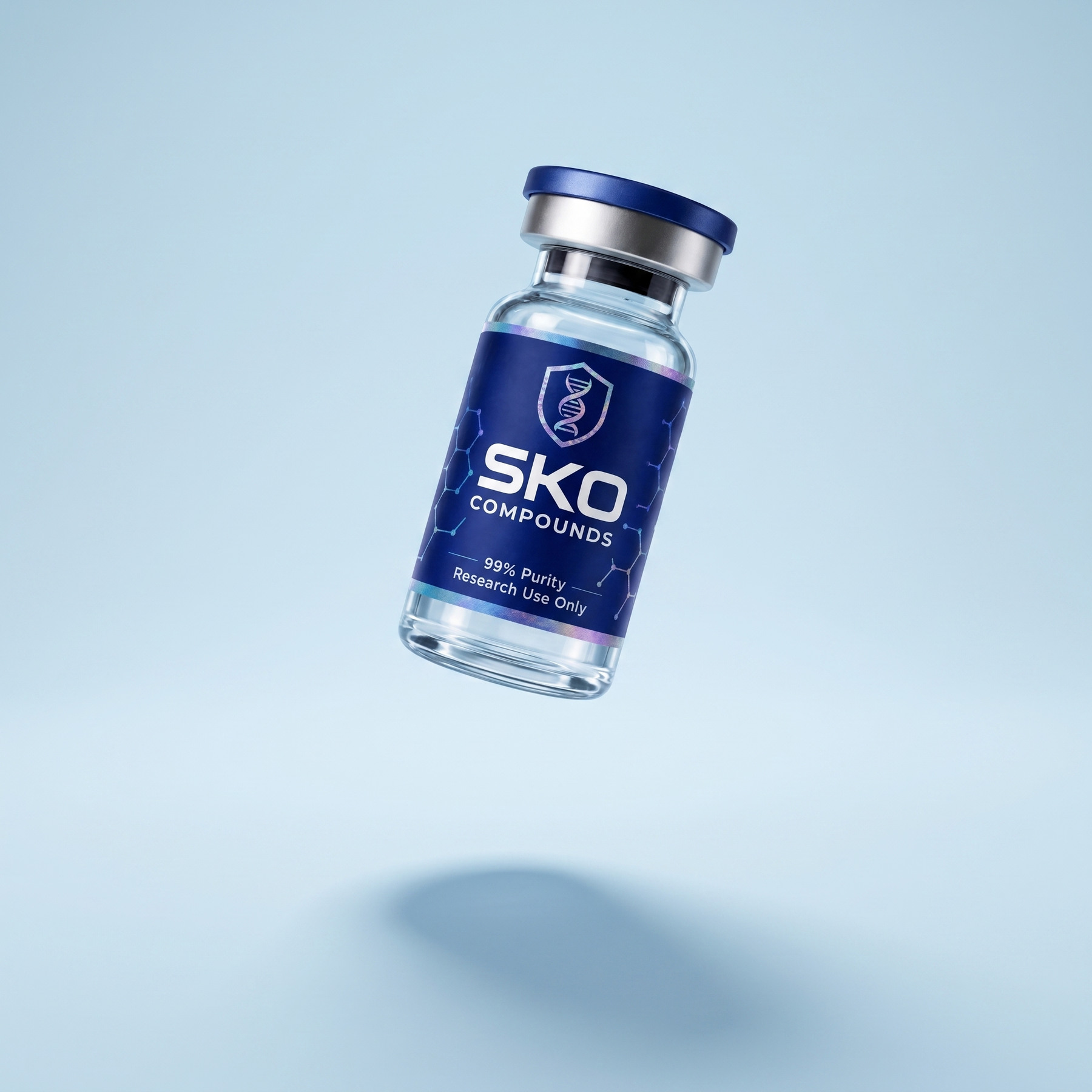
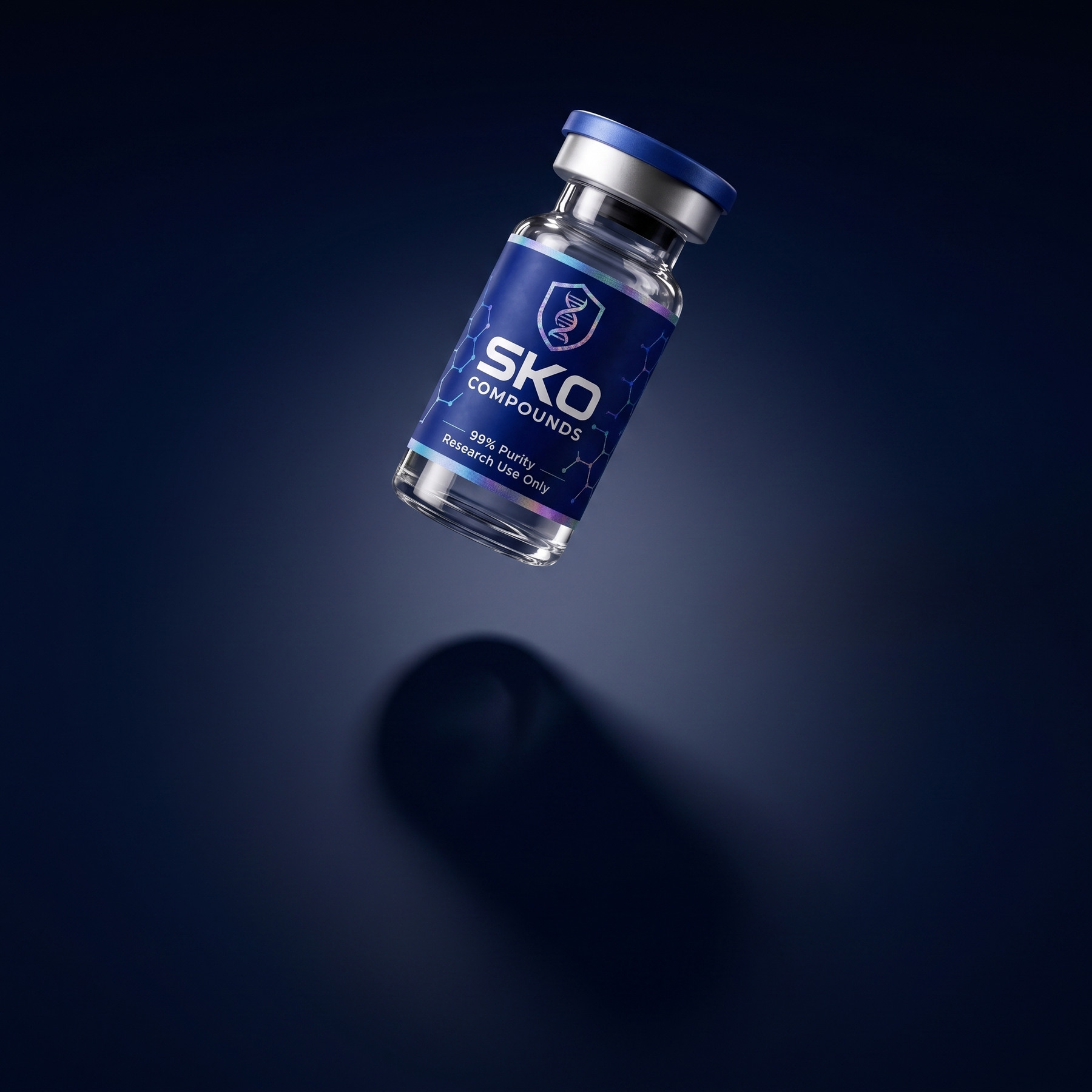
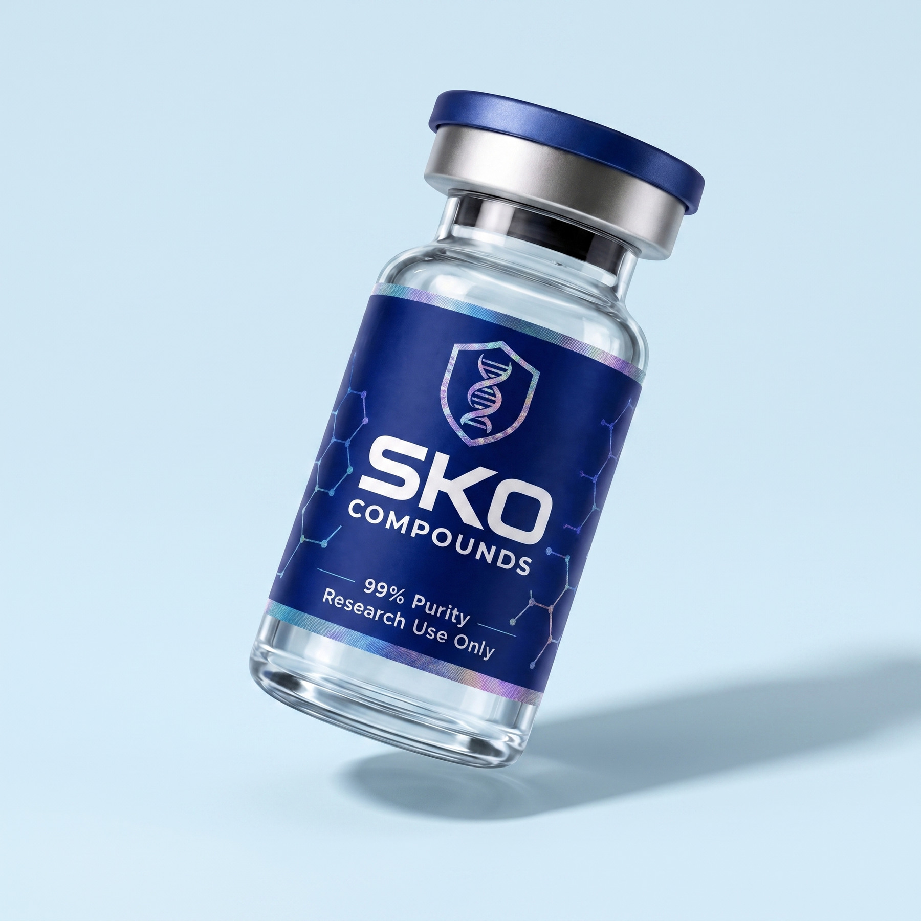
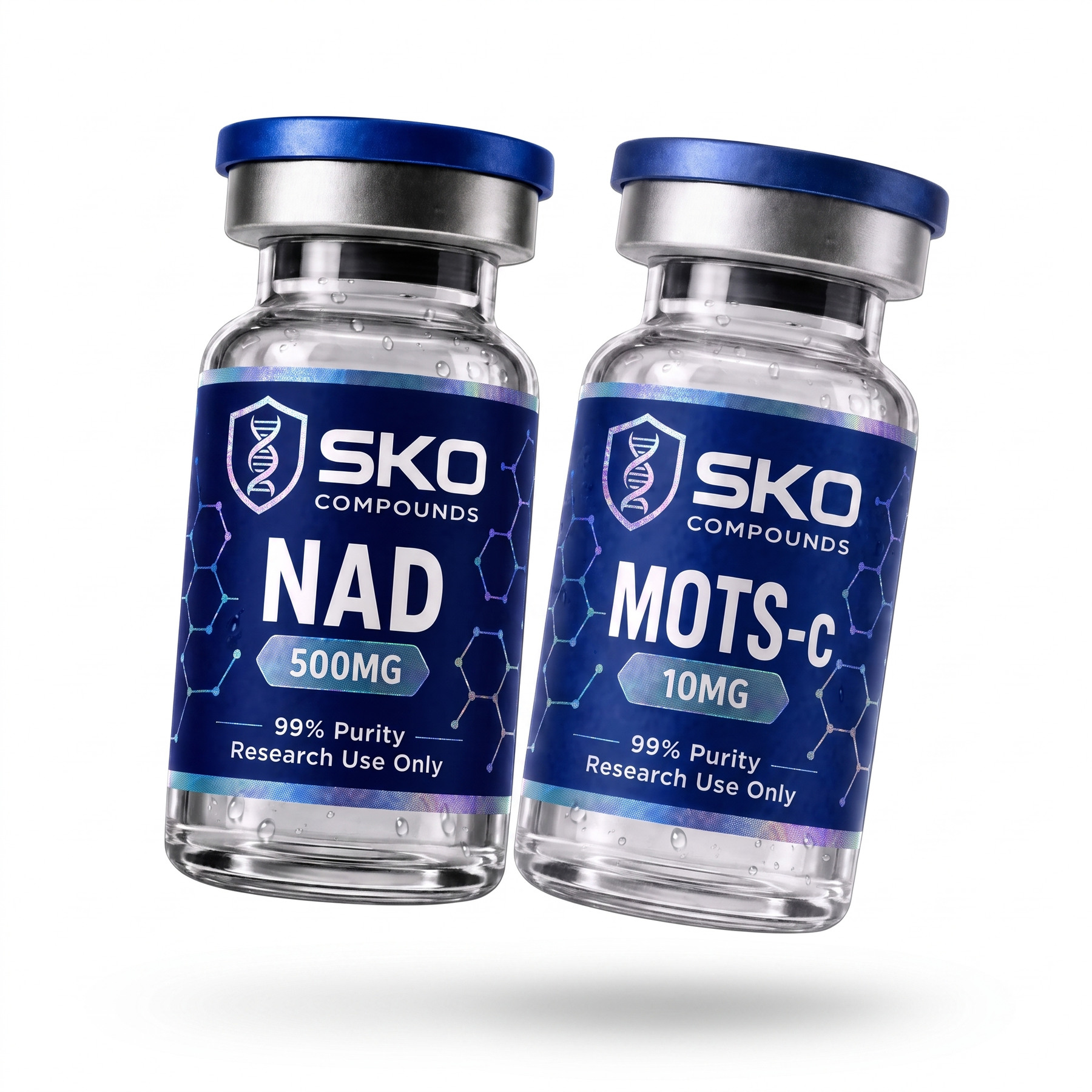
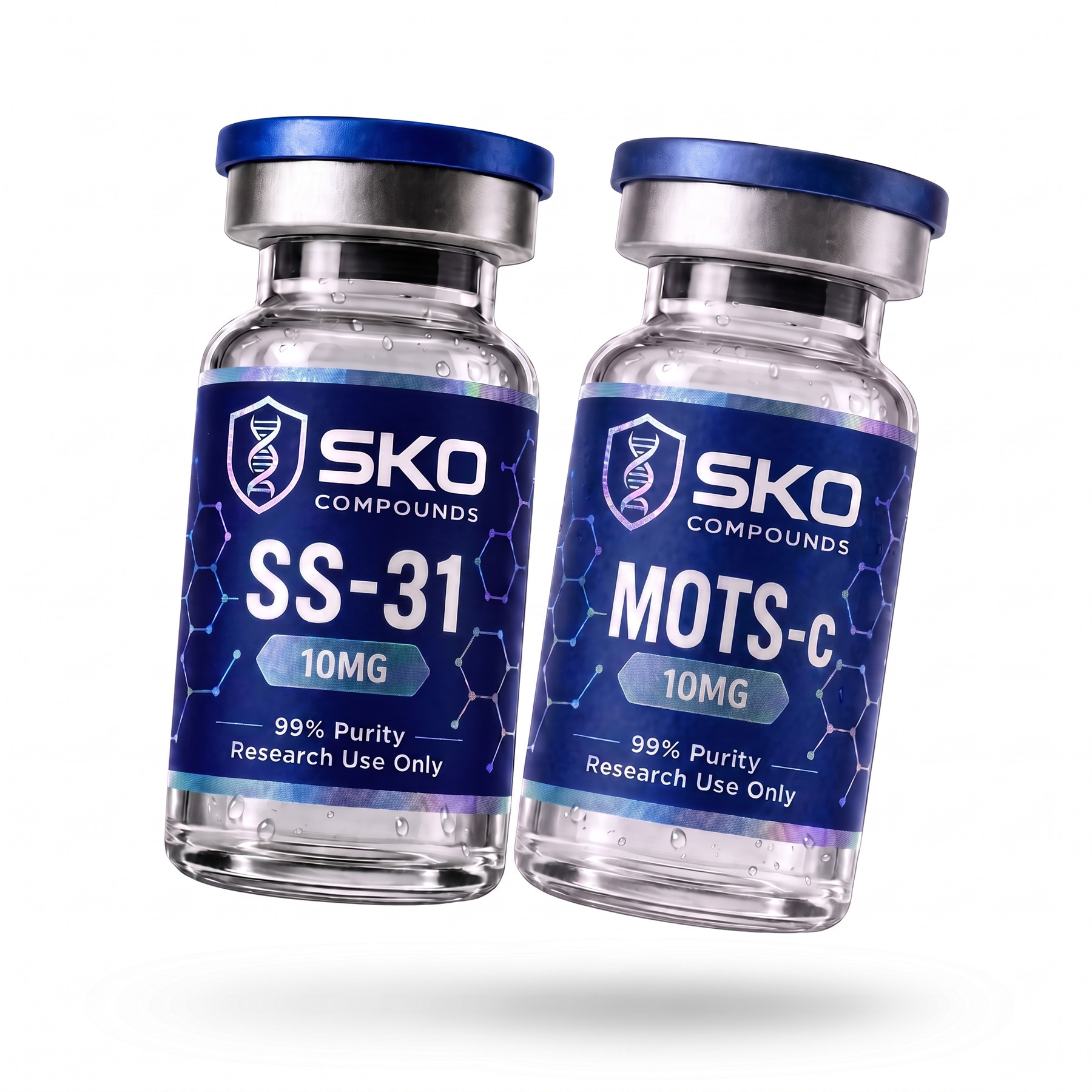
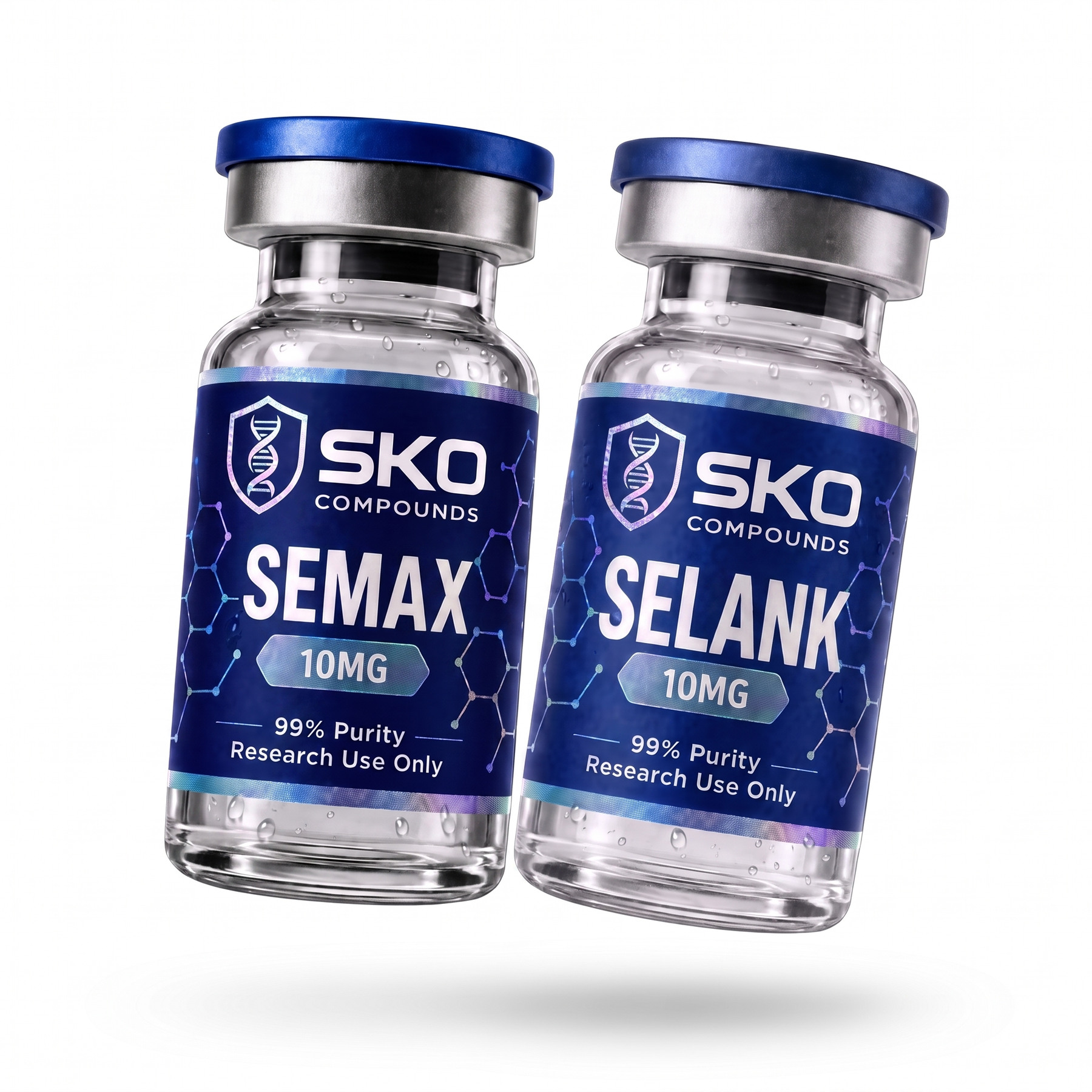
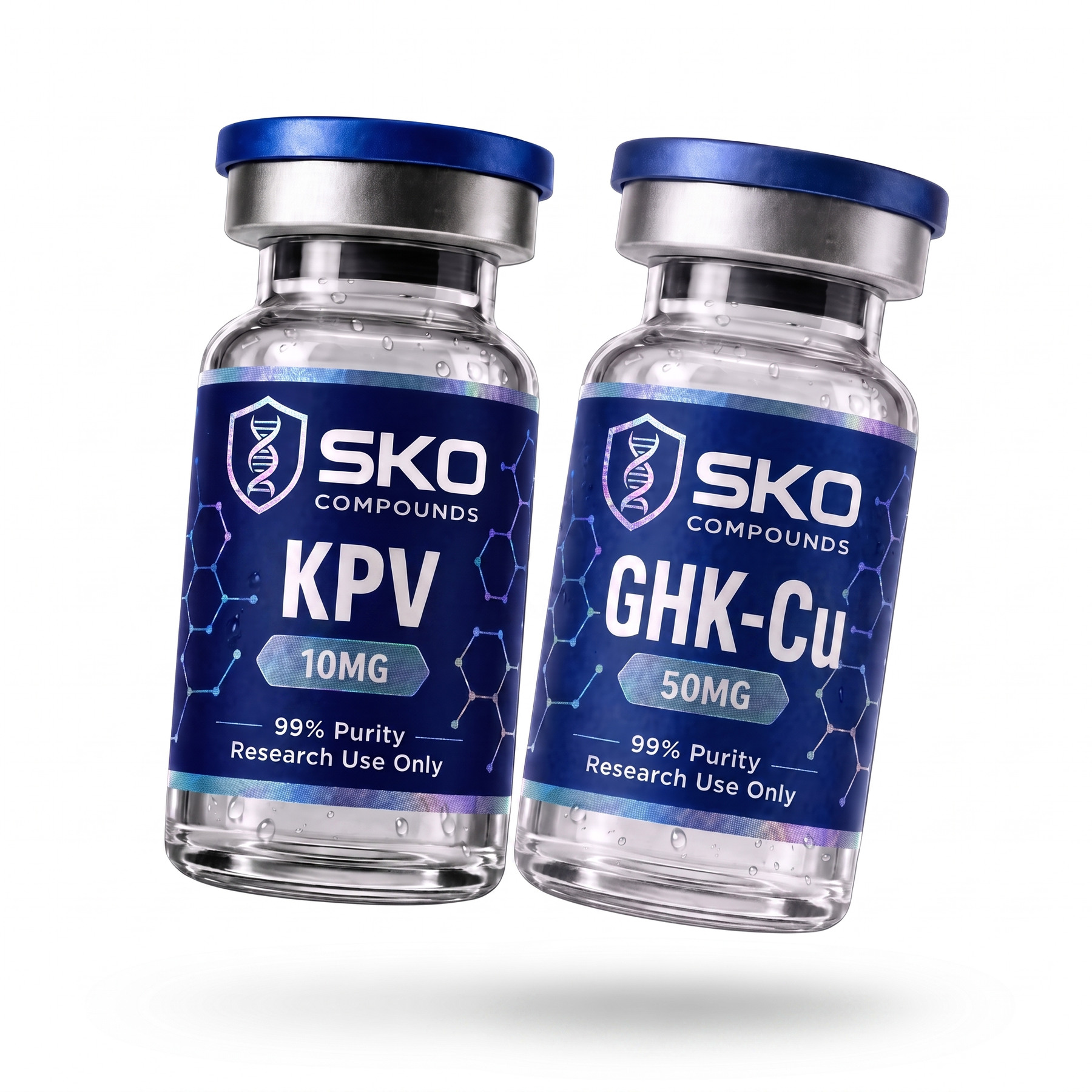
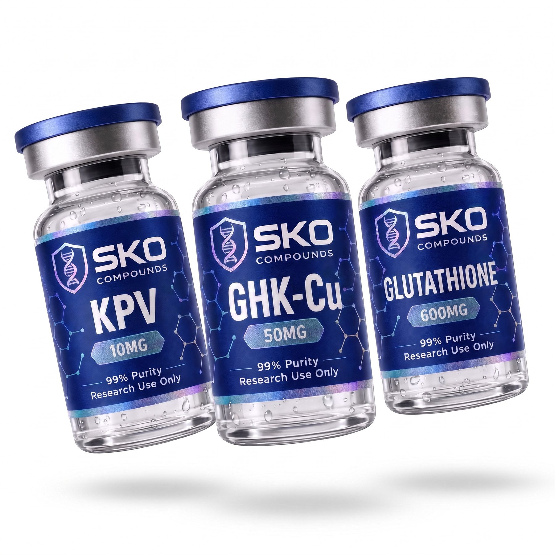
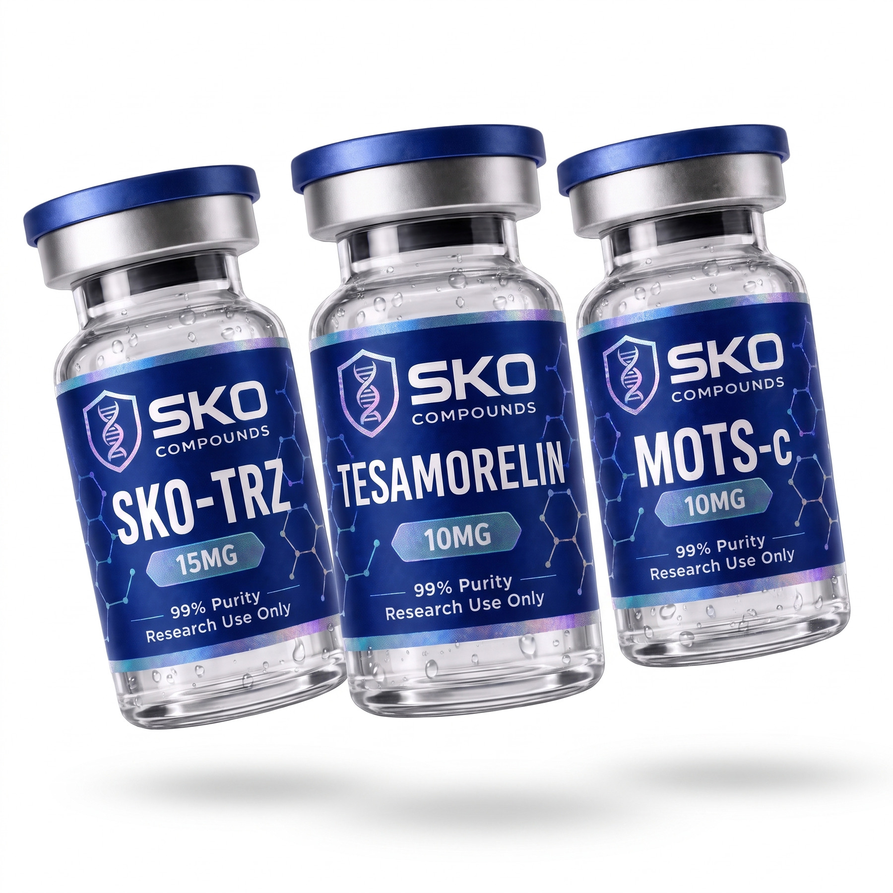
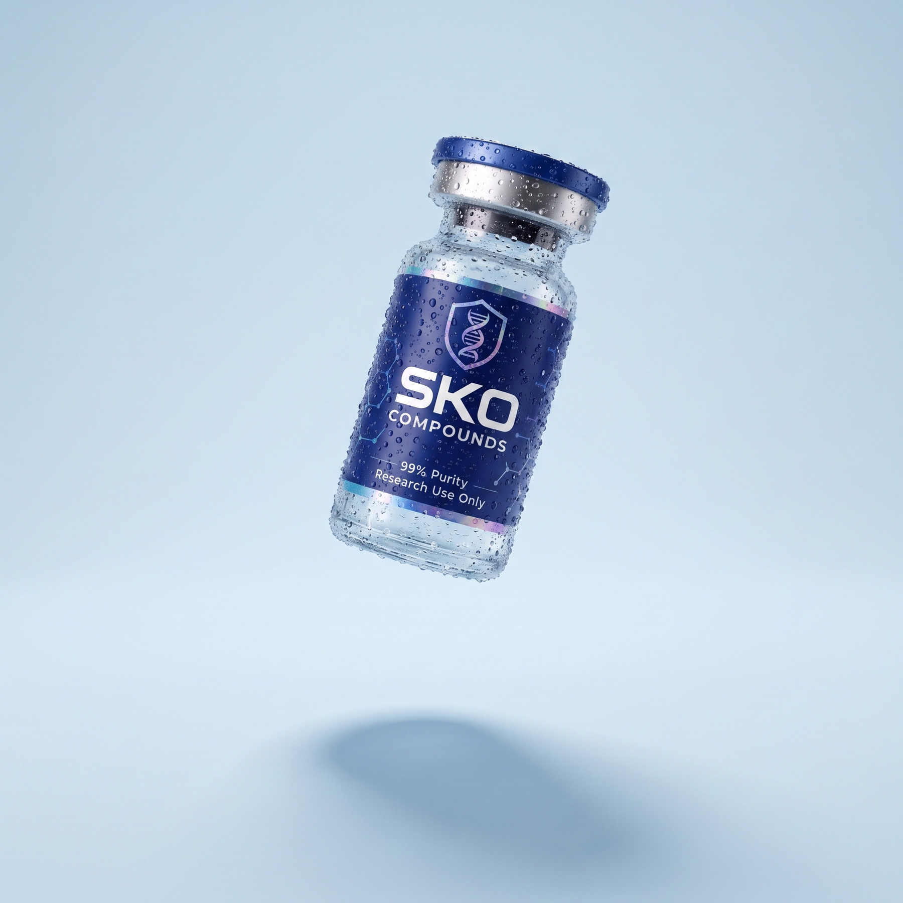
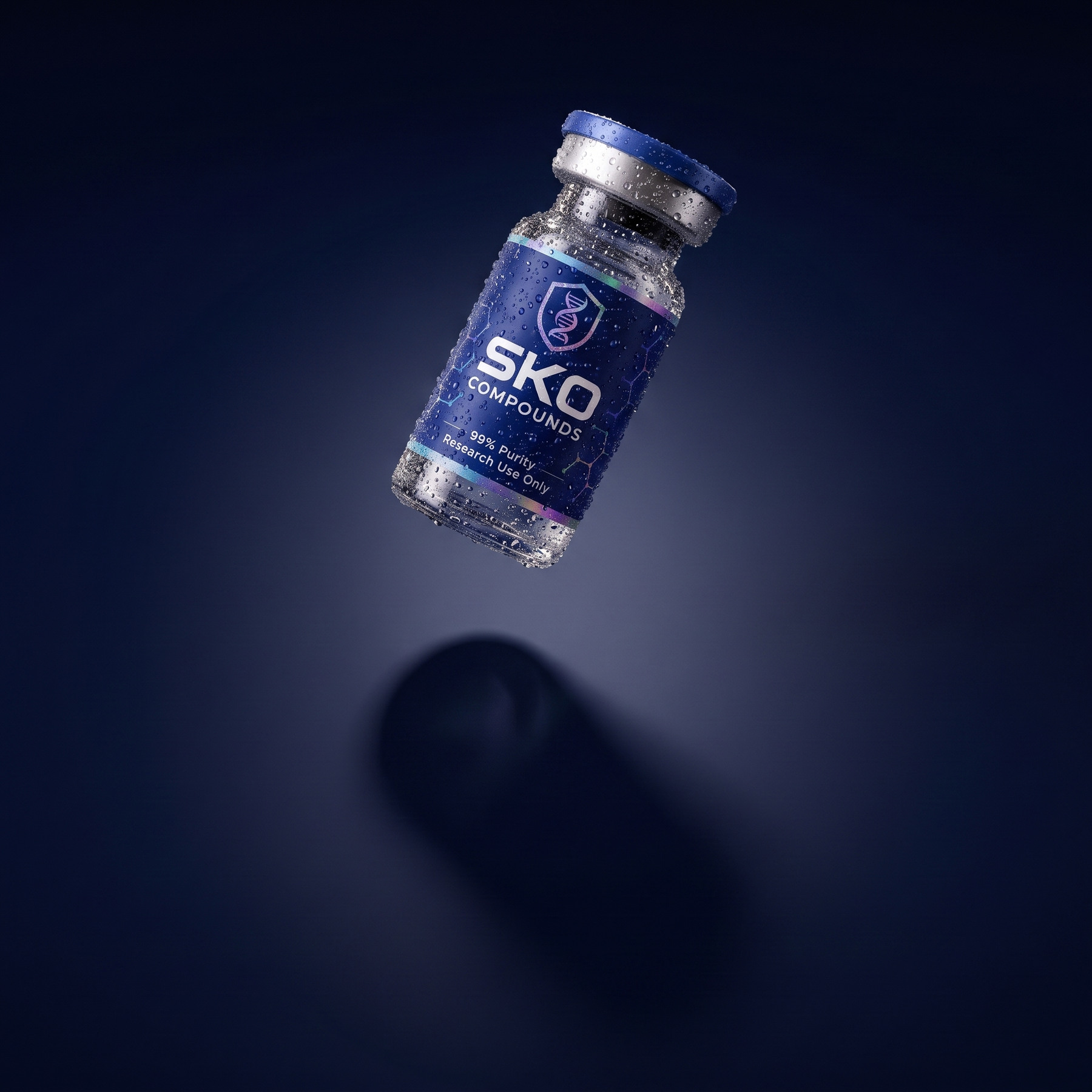
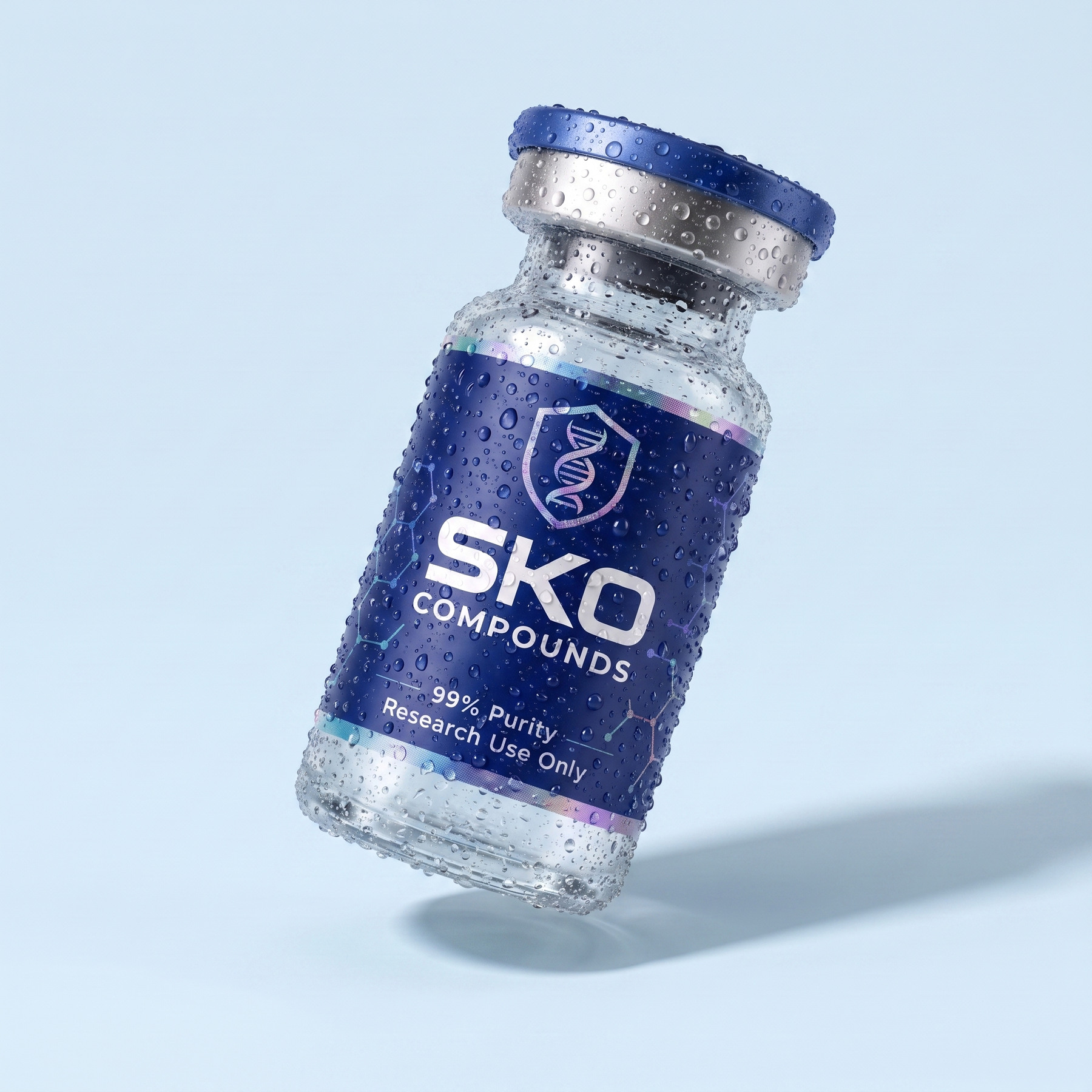
SKO BRAND BOOKIDENTITYThe product is in every piece of content we put out, so this is the most-used page in the book. Every image starts from the catalogue render, which means the label is always the real label: right SKU, right dose, both foil bands. What changes is the world around it, and that world has four rules.
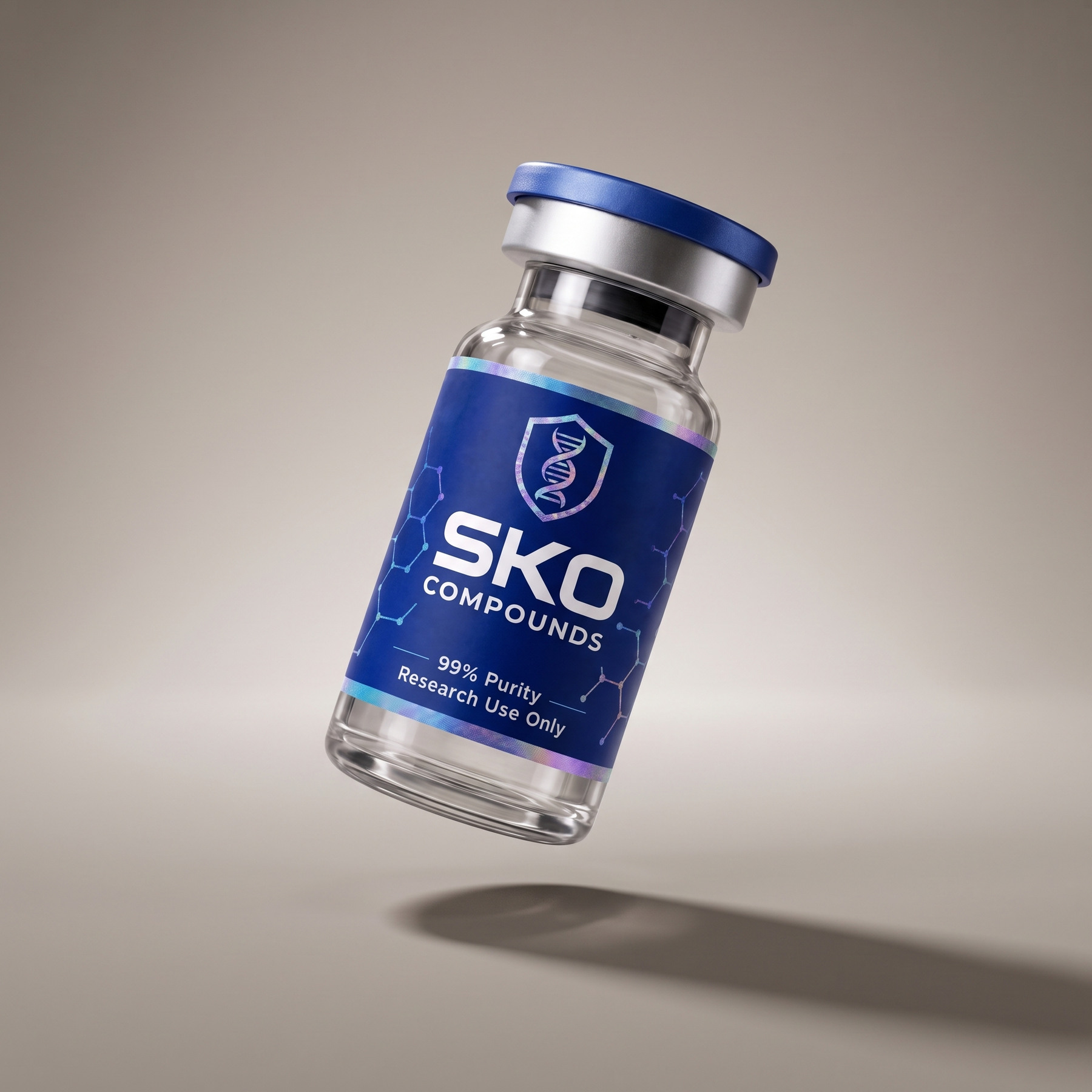
One light, high and to the left. The shadow falls on the seamless, never on a floor with an edge in it. The label reads: nothing crosses it, nothing tints it, the bottle is never warped, flipped or re-lettered.
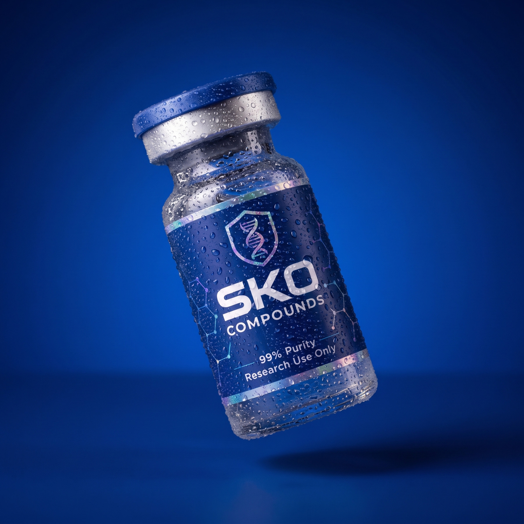
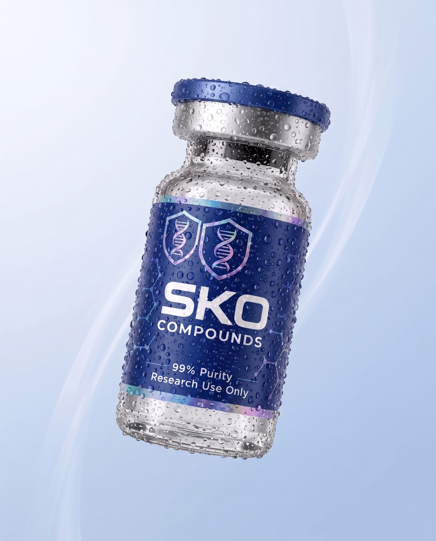
Dry or wet — both are approved. The studio plates are dry glass. The wet cut is the same plate with condensation on the glass and cap, the foil catching the key; it is an option, not a rule. Use it when the frame wants cold and fresh, and the dry plate when it wants clean and clinical. Every plate on this page has both.
The studio masters on the warm seamless are for listings and product pages. Bundles sit on white to match the site. The Field and the floats are for ads and social.
CLICK ANY PLATE TO DOWNLOAD
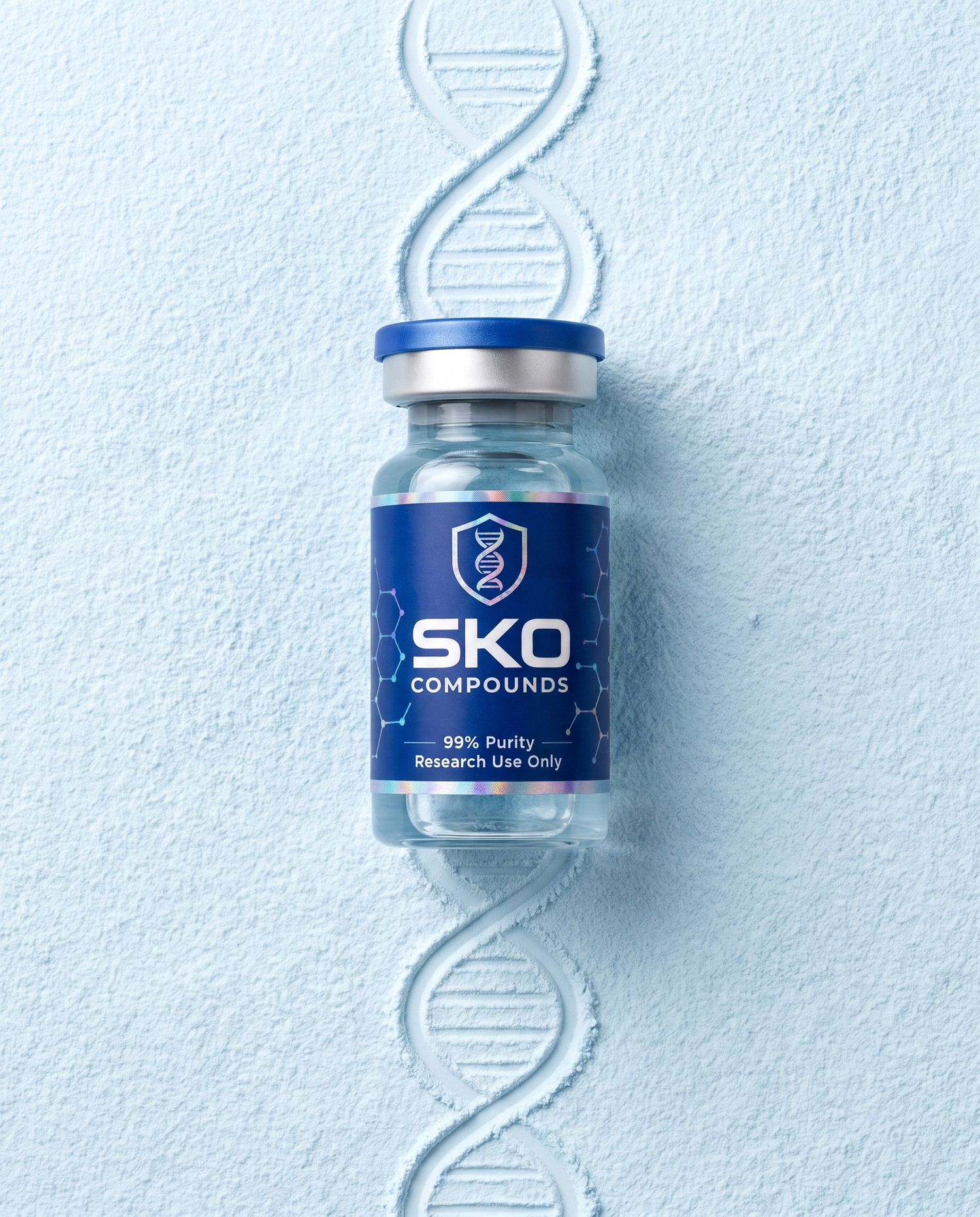
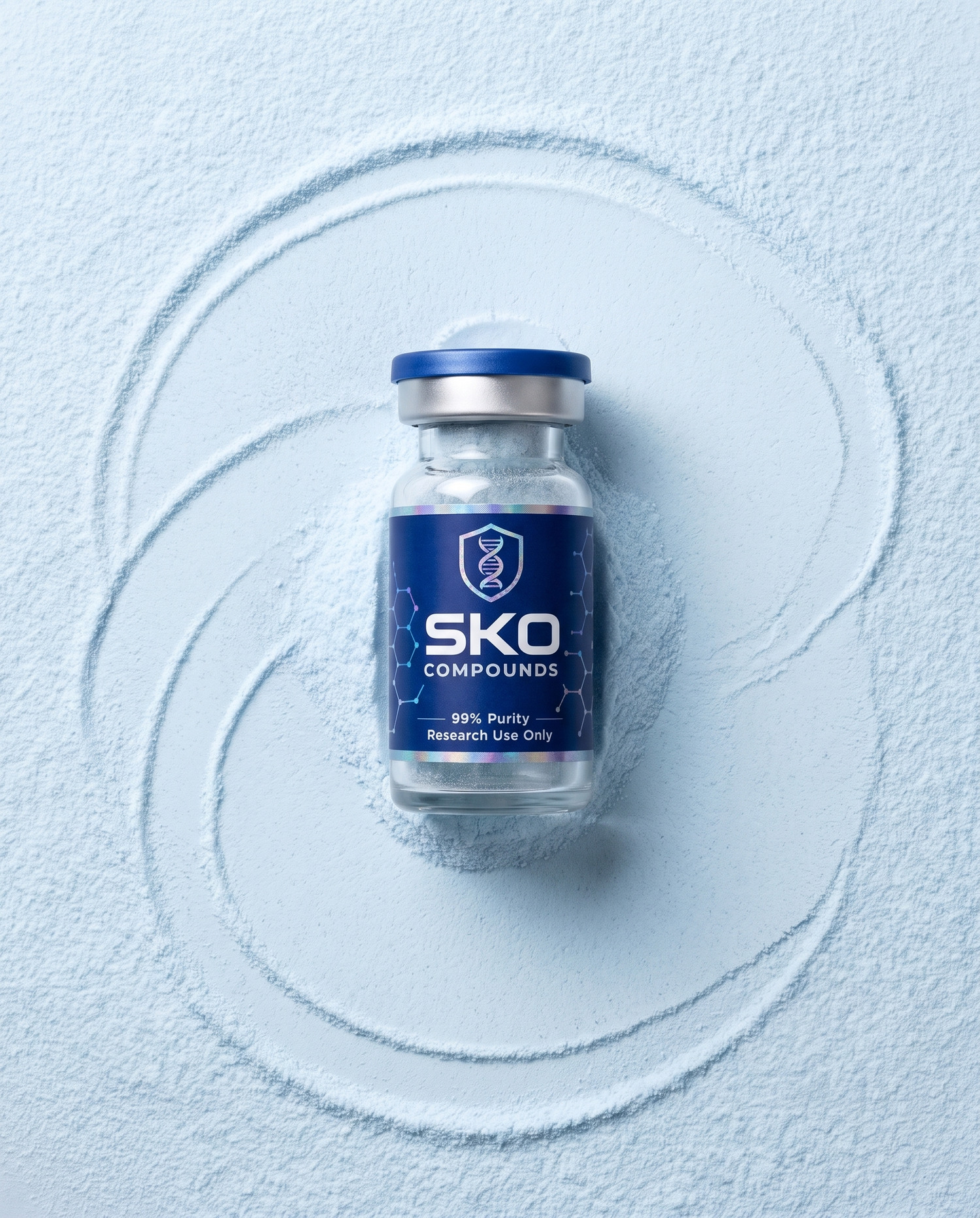
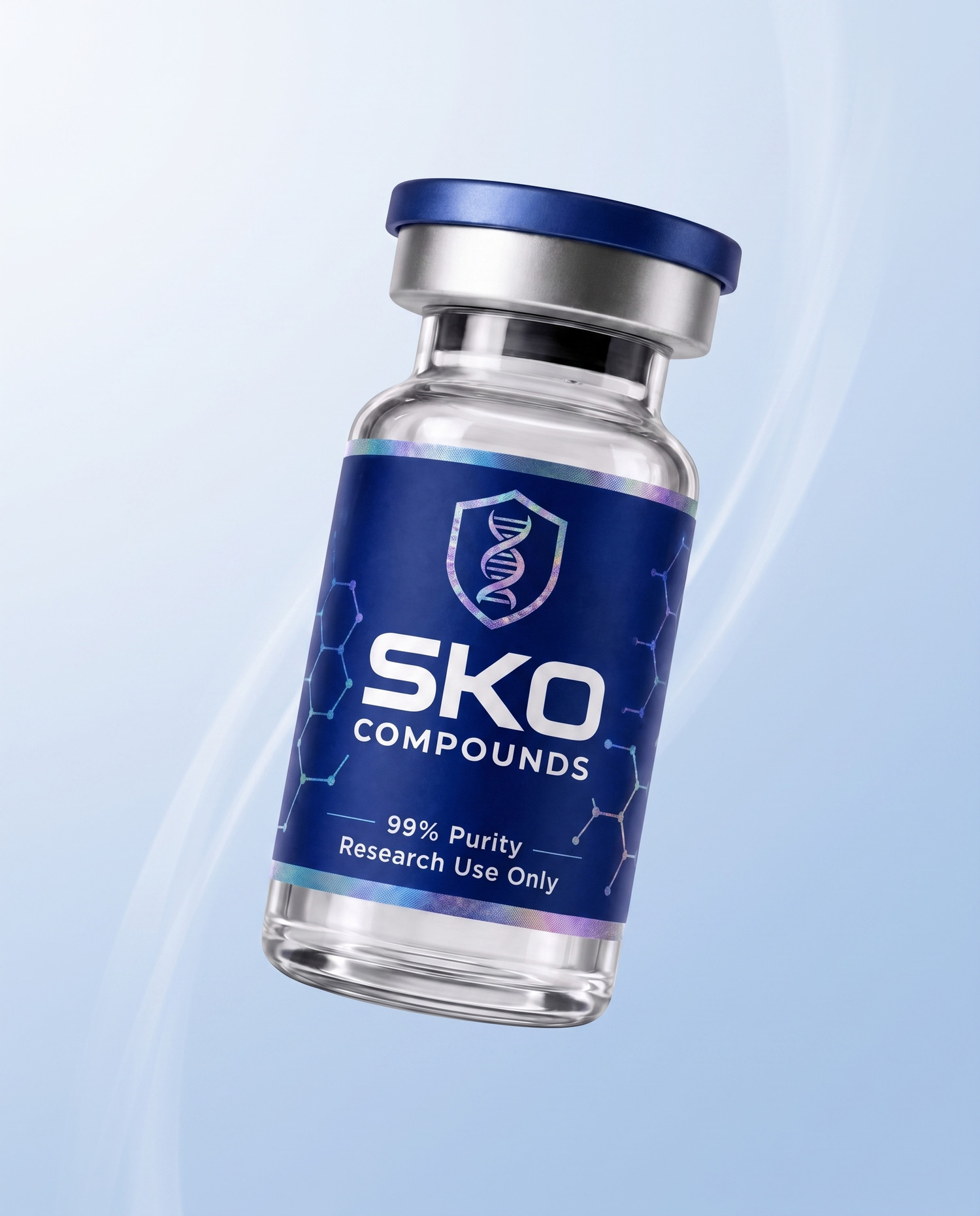
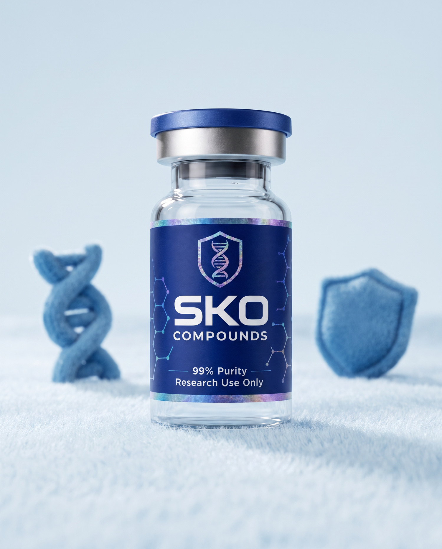
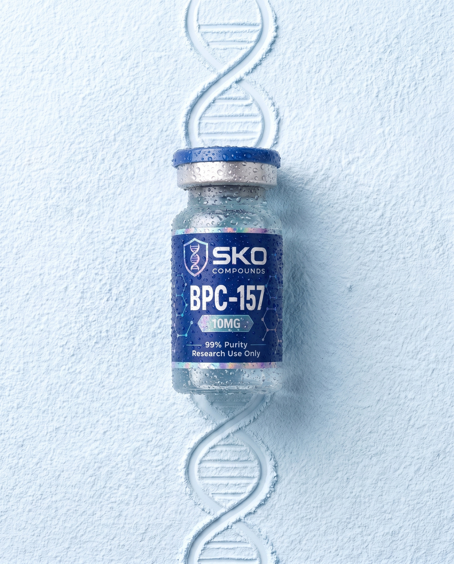
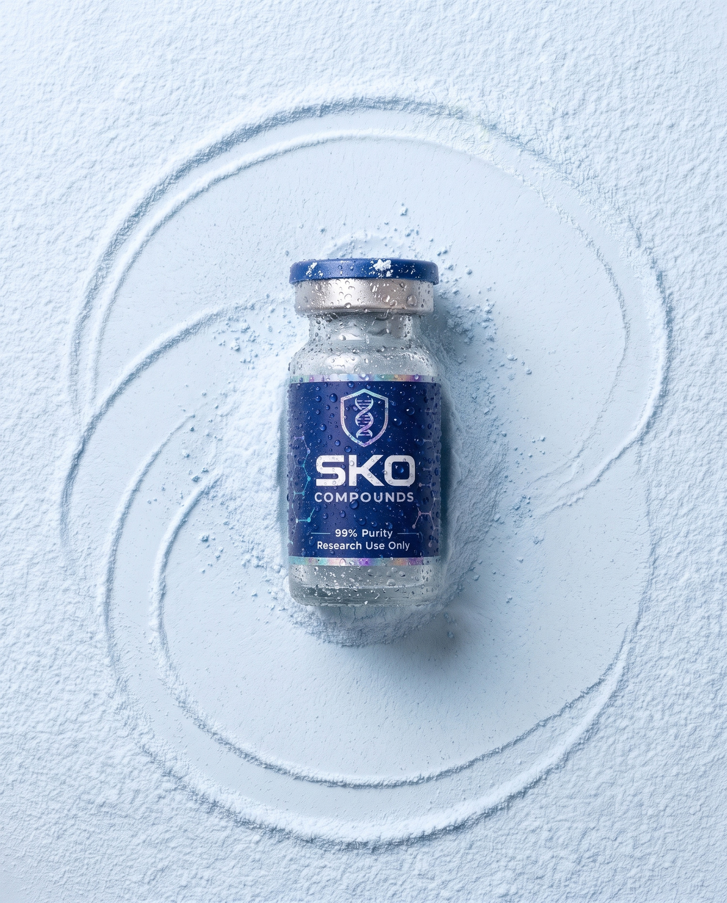
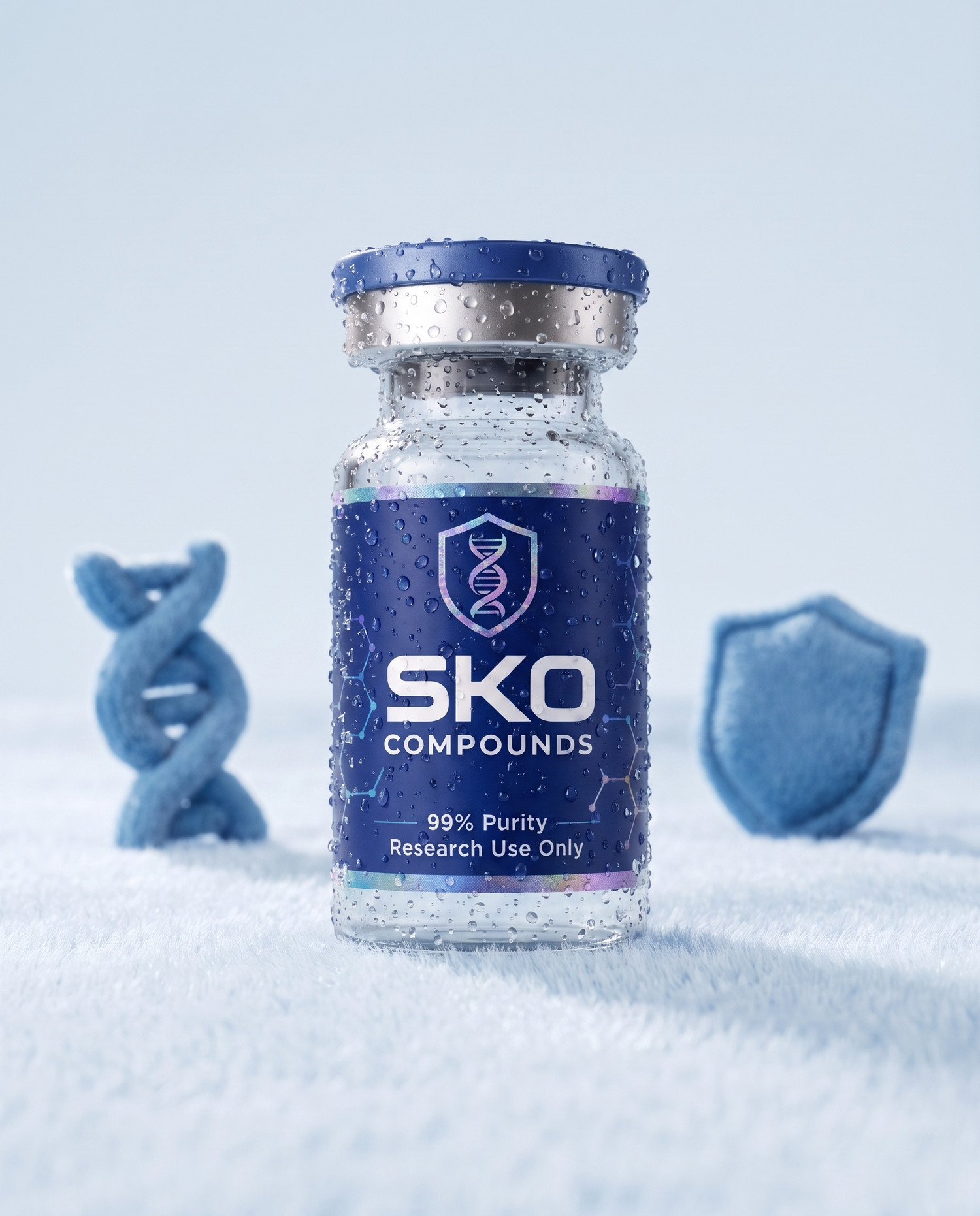
SKO BRAND BOOKPHOTOGRAPHYFour editorial set-ups for when the product needs a world: the helix drawn in sand with the vial resting on it; the vial in a fine light-blue powder; the vial with light moving behind it; and the plush set, where the helix and the shield are soft objects beside it.
In every one the brand asset is in the world and the vial is on top of it. The helix, the shield and the compound appear as things — drawn, poured, sewn — and they never compete with the label. The palette holds: sand and powder are Halo, the plush is Deep and Halo, the light is white.
Nothing candid, nothing lifestyle. No hands, no kitchens, no gym bags. The marble and Halo lifts round out the set for the site. Each moment also has a wet cut on the Assets page.
CLICK ANY PLATE TO DOWNLOAD
SKO BRAND BOOKPHOTOGRAPHYEvery offering, as the bottle it is. All thirty-nine listings, each one its own catalogue render with the name, size and price read off the live store, held in a cloud over the flat Field. Nothing sits in the middle of it. The blue bottle is the brand, so the bottles are the whole object.
The ground is Field #244399, flat. No gradient, no vignette. Depth comes from the bottles themselves: the near ones large and solid, the far ones small and faint.
Drag to spin it. It carries momentum and settles. Wheel to zoom. Hovering lifts a bottle and holds the cloud still. Click brings that bottle to the centre and dims the rest; click it again to open the product, or click away to release it.
Used as the catalogue on the site, and as the closing frame of any spot that shows the range.
SKO BRAND BOOKSUBJECTThis is the complete approved vocabulary. A claim not on this list does not go into an asset until ownership adds it here.
Figures are re-verified before each flight, never copied forward.
| 99% Purity | PRINTED ON LABEL |
| Research Use Only | MANDATORY |
| 8× Tested | OVERLAY STRIP |
| Beverly Hills | OVERLAY STRIP |
| Over 38k orders shipped | CONFIRMED BY OWNERSHIP |
| Out the door in 24 hours | CARRIES ITS OWN REMEDY |
SKO BRAND BOOKLANGUAGEEverything the team needs, on the page that documents it. Click any row to download.
Start from the vector. Every flat cut on this page was rendered from it, so if a size or a colour is missing, render it — do not redraw it and do not upscale a PNG.
The system plates — field, bar, bleed, mark, woven shield — download from their own pages, where the rule that governs them is written.
The first edition of this book is kept whole at v1.html. Product imagery is not here. It lives in the catalogue and the stills folders and is pulled from there, never redrawn.
One path, every subpath, even-odd fill. Scales without limit, recolours to anything, prints and embroiders flat. Never re-trace the mark from a raster.
 DOWNLOAD
 DOWNLOAD
Seven cuts off the cover helix, 9:16 at 1536×2752. Same geometry in all seven; only the material changes.
DOWNLOAD
DOWNLOAD
DOWNLOAD
DOWNLOAD
DOWNLOAD
DOWNLOAD
DOWNLOAD
The studio masters and the moments, web weight. The 2048 masters live in the product-masters folder. Bundles are on white for the site.
 DOWNLOAD
 DOWNLOAD
 DOWNLOAD
 DOWNLOAD
 DOWNLOAD
 DOWNLOAD
 DOWNLOAD
 DOWNLOAD
 DOWNLOAD
 DOWNLOAD
 DOWNLOAD
 DOWNLOAD
 DOWNLOAD
 DOWNLOAD
 DOWNLOAD
 DOWNLOAD
 DOWNLOAD
The same plates with condensation on the glass. An option, not a rule.
DOWNLOAD
 DOWNLOAD
 DOWNLOAD
 DOWNLOAD
 DOWNLOAD
 DOWNLOAD
 DOWNLOAD
 DOWNLOAD
 DOWNLOAD
 DOWNLOAD
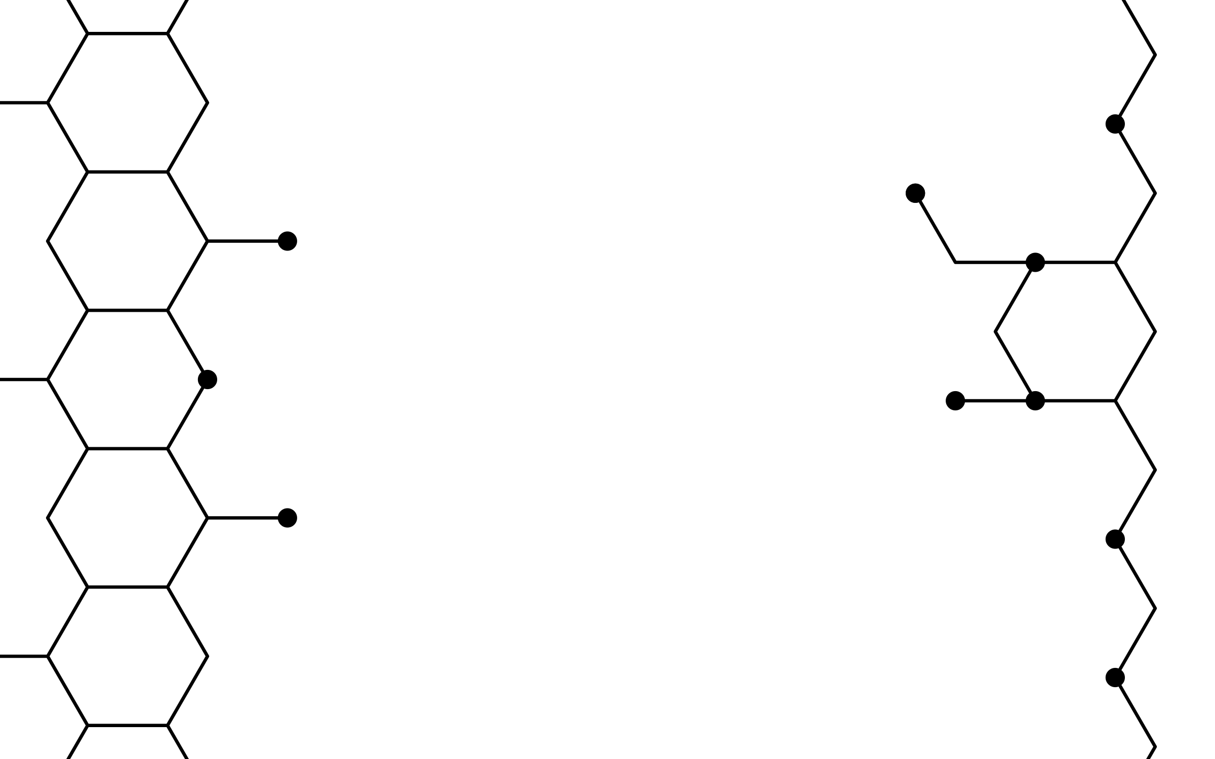
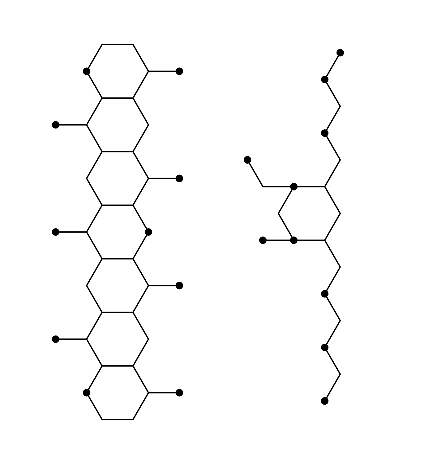
The two rendered masters first. Then the flat cuts, drawn to the grid for print and small sizes: the composition is the two fragments at the edges of a 16:9 frame, already fading; the fragments file is the same two drawn whole, for placing by hand. Both take currentColor.
 DOWNLOAD
 DOWNLOAD
 DOWNLOAD
 DOWNLOAD
 DOWNLOAD
 DOWNLOAD
 DOWNLOAD
 DOWNLOAD
 DOWNLOAD
 DOWNLOAD
 DOWNLOAD
 DOWNLOAD
 DOWNLOAD
 DOWNLOAD
 DOWNLOAD
 DOWNLOAD
 DOWNLOAD
Two cuts. PLAIN is the solid silhouette with no helix — the badge, and the one to use over a photograph. MARK has the helix knocked out, so the helix takes the ground colour. Both one colour, cut from the vector. Use these below ~48px and anywhere the mark sits on an image.
DOWNLOAD
DOWNLOAD
DOWNLOAD
DOWNLOAD
DOWNLOAD
DOWNLOAD
 DOWNLOAD
 DOWNLOAD
SKO BRAND BOOKASSETS
DOWNLOAD
DOWNLOAD
SKO BRAND BOOKASSETS