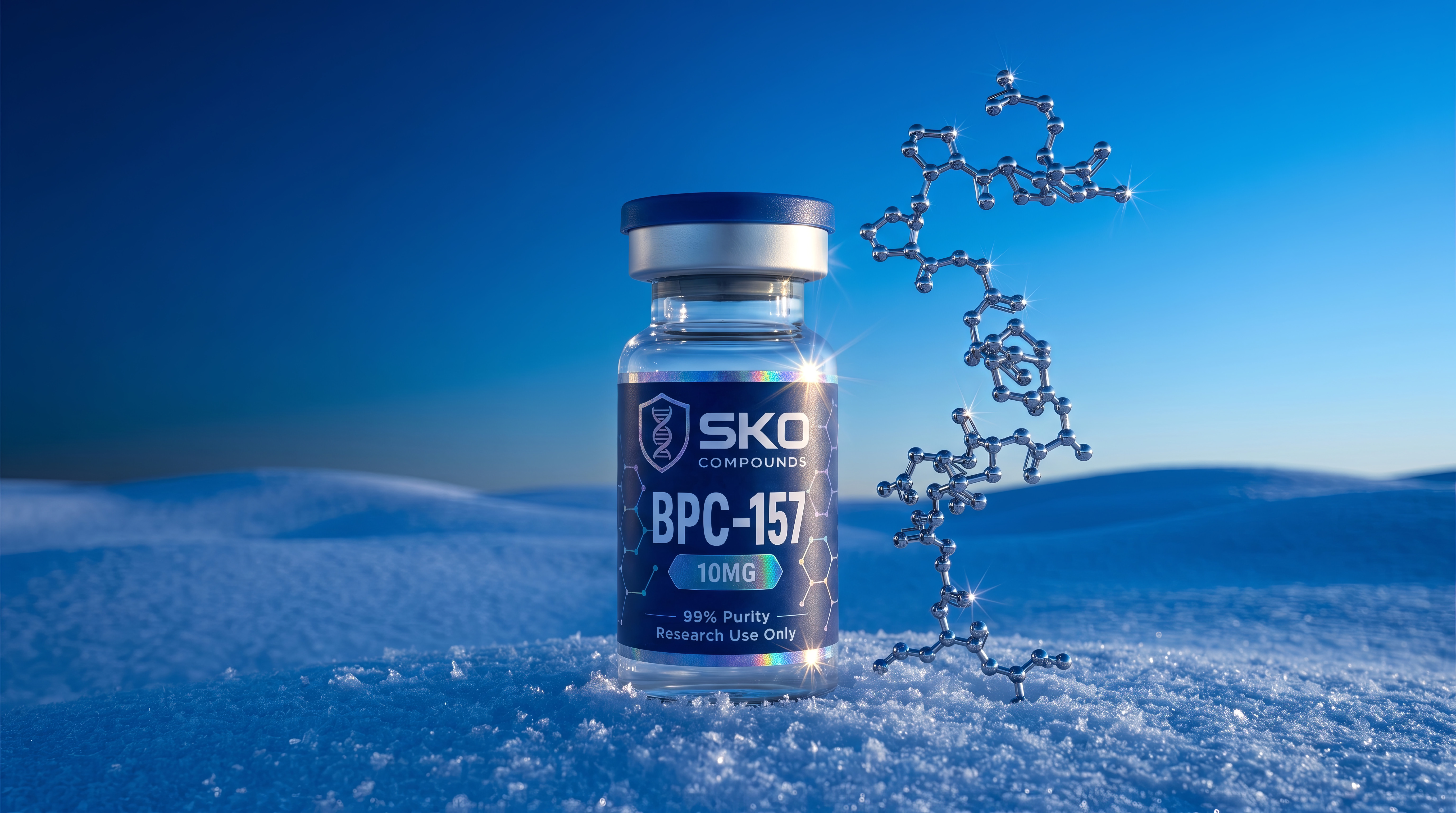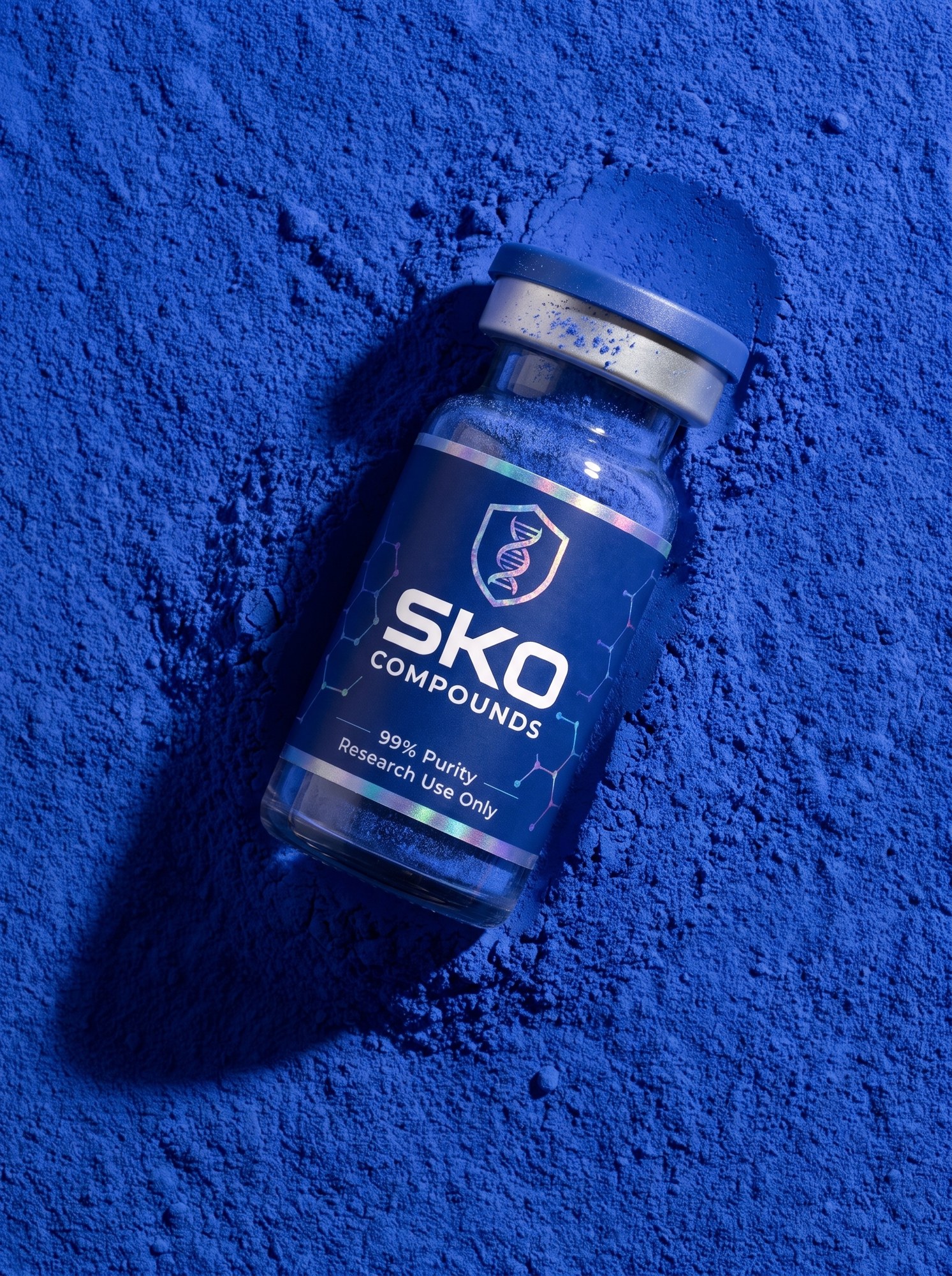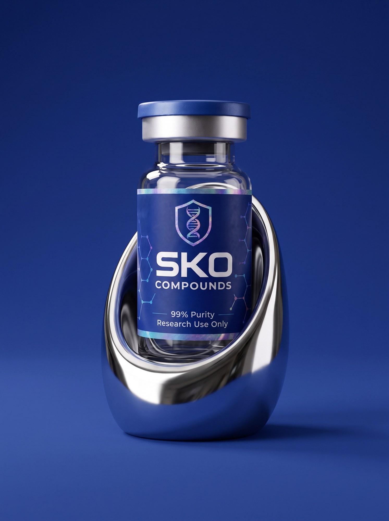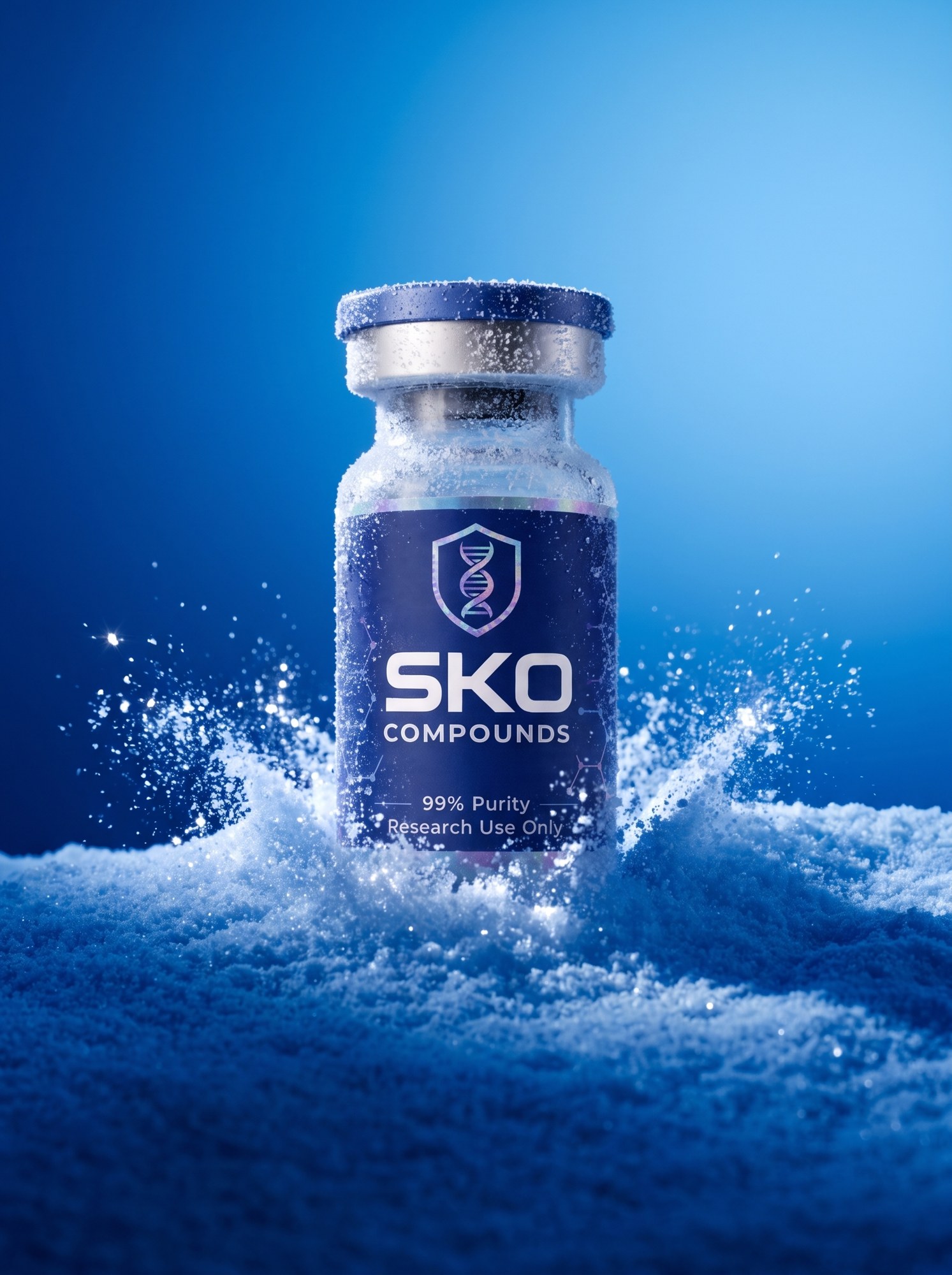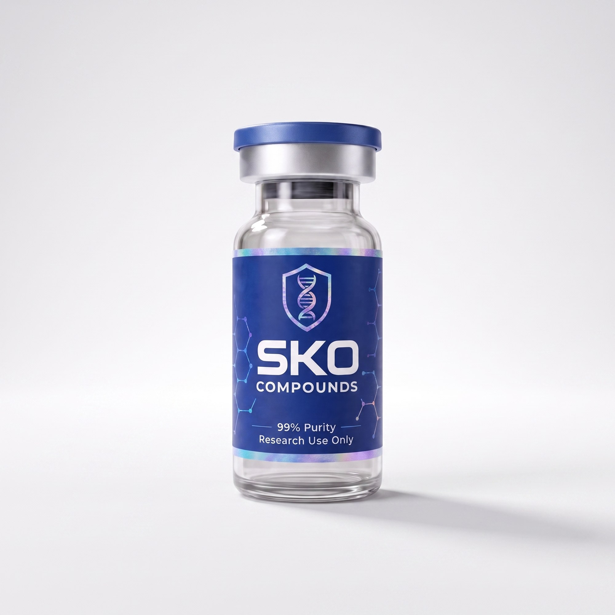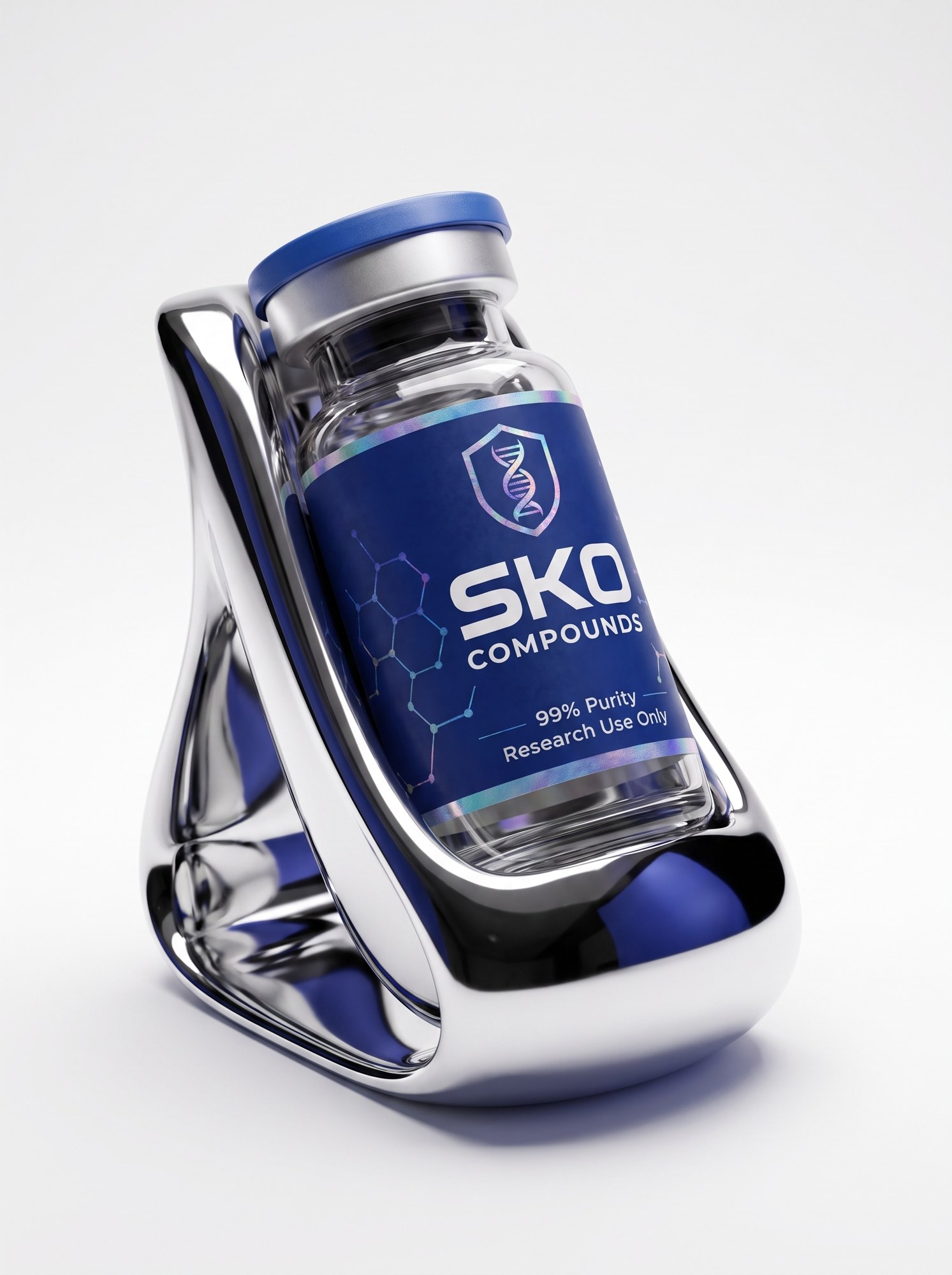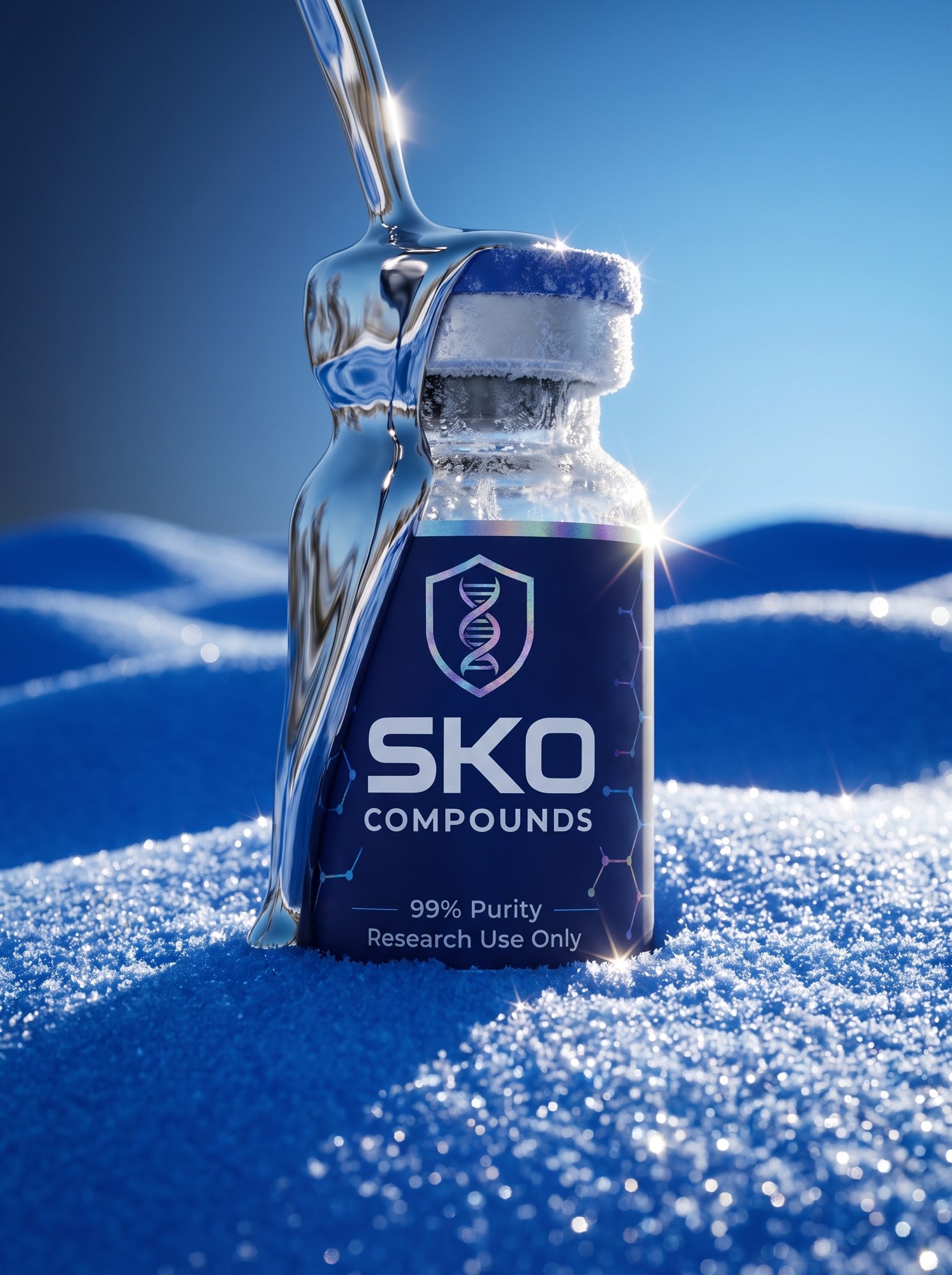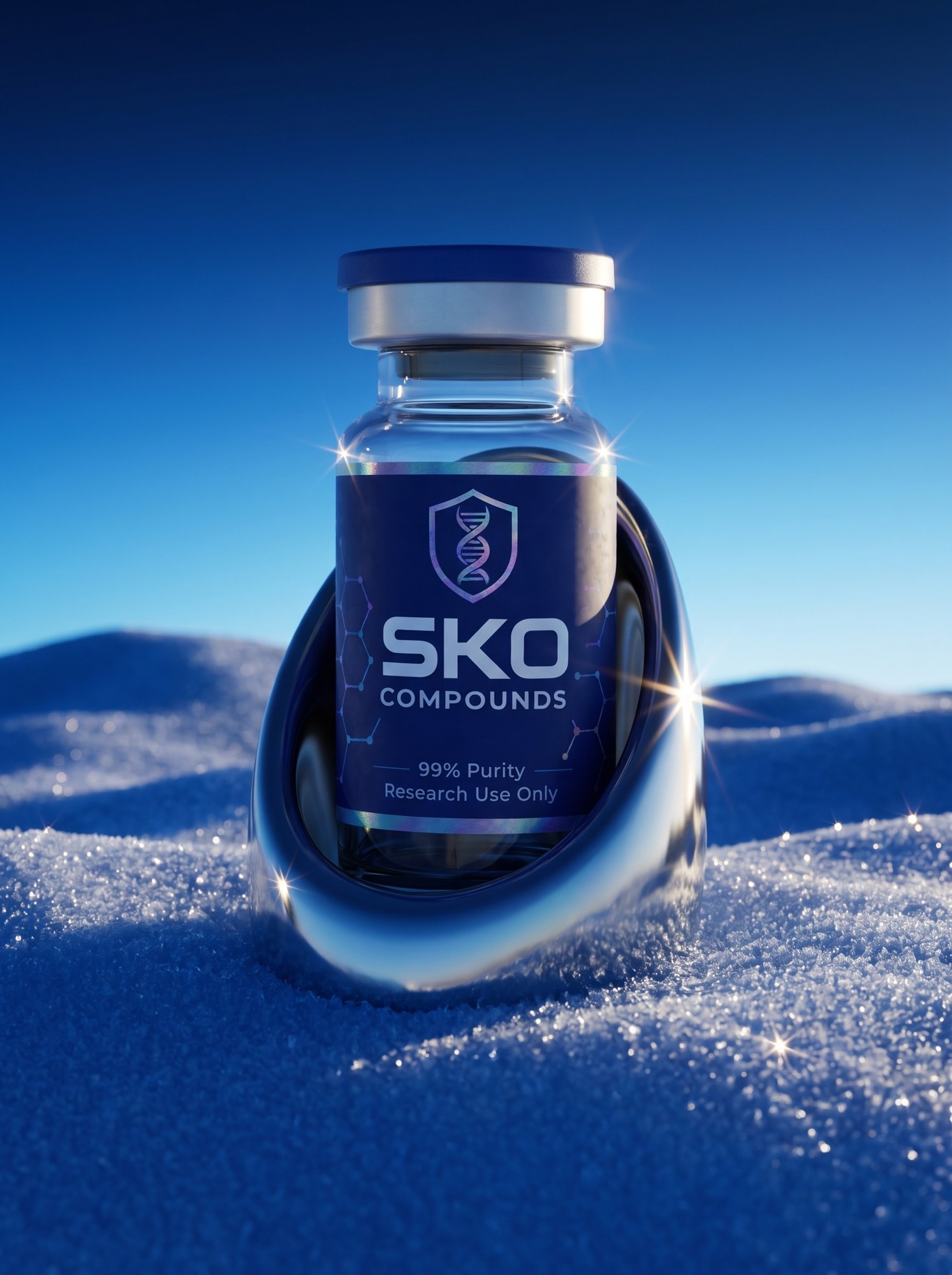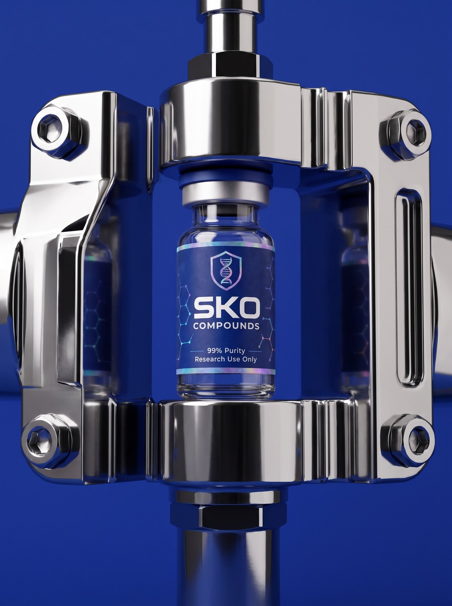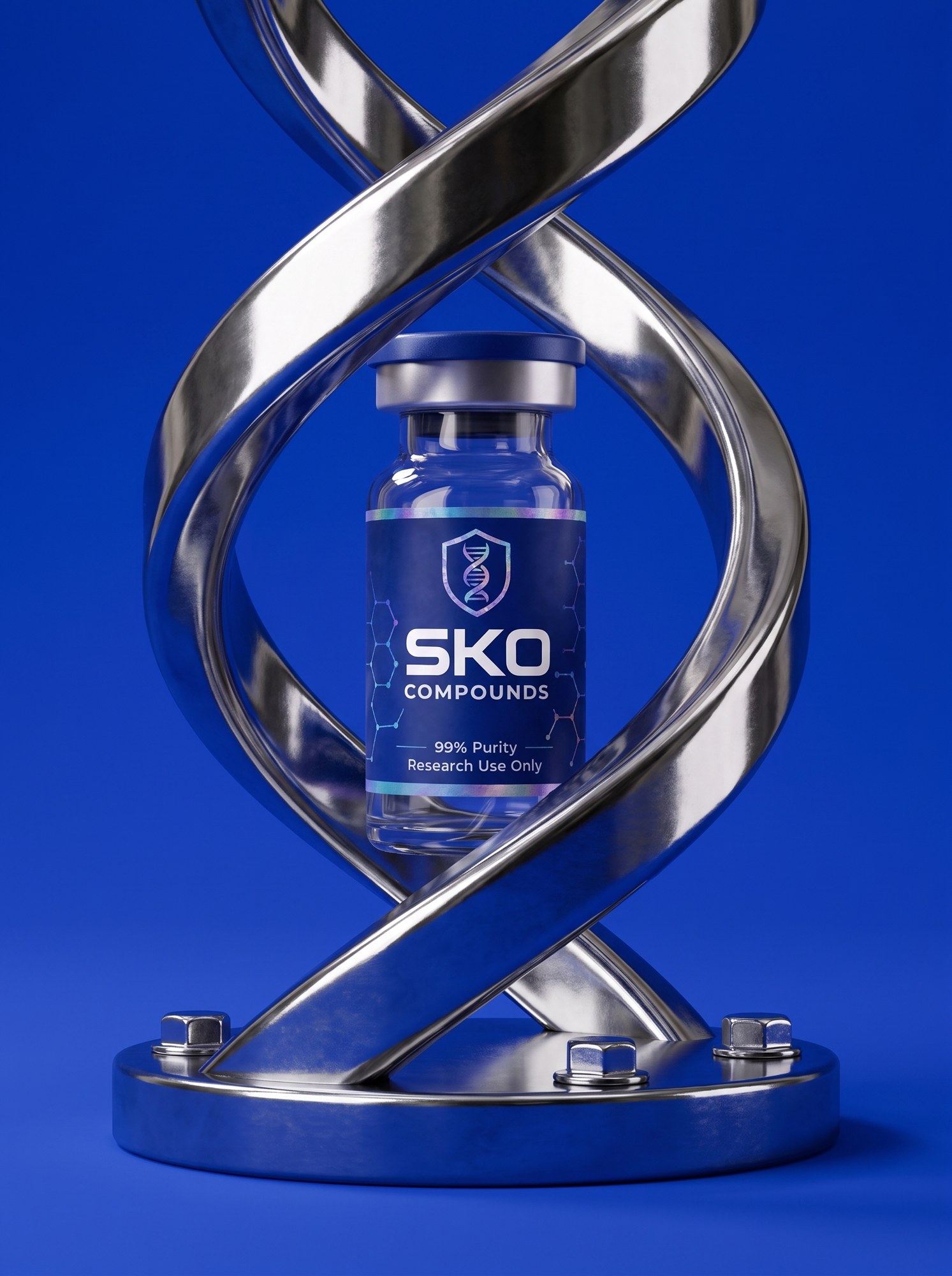

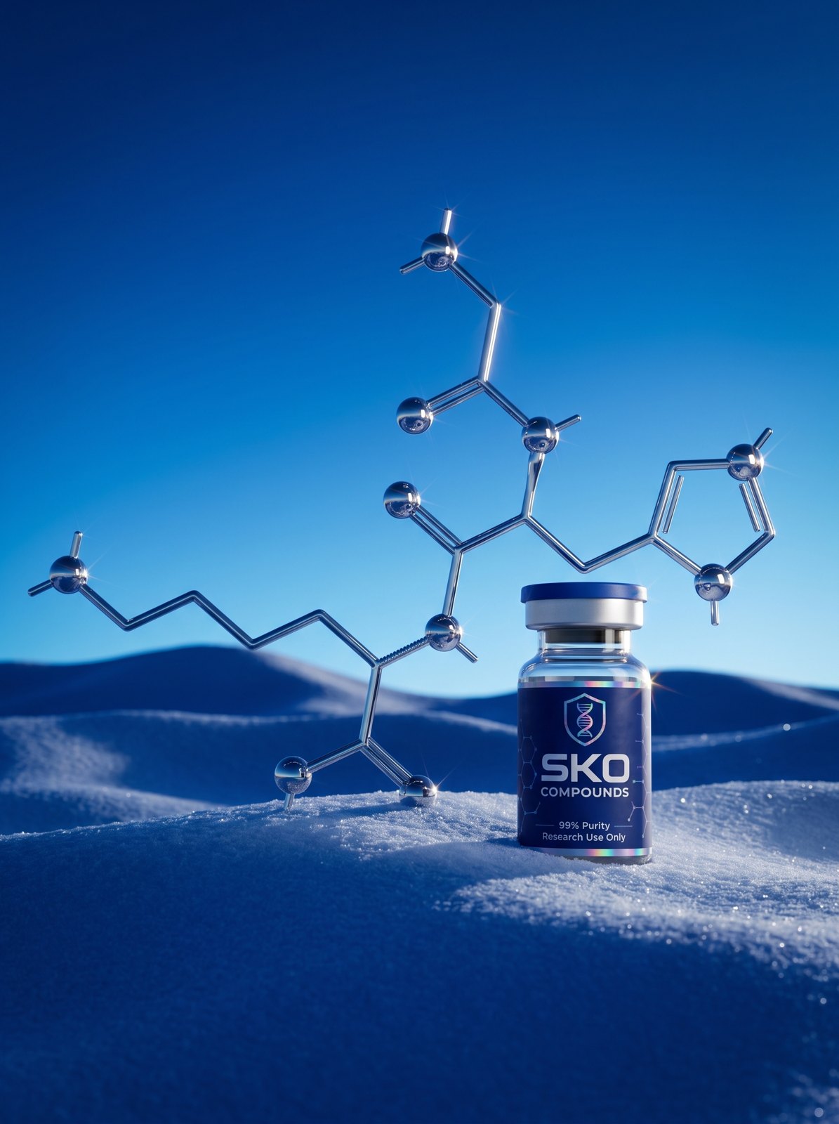
 THE DEVICE · THE MOLECULE IN CHROME
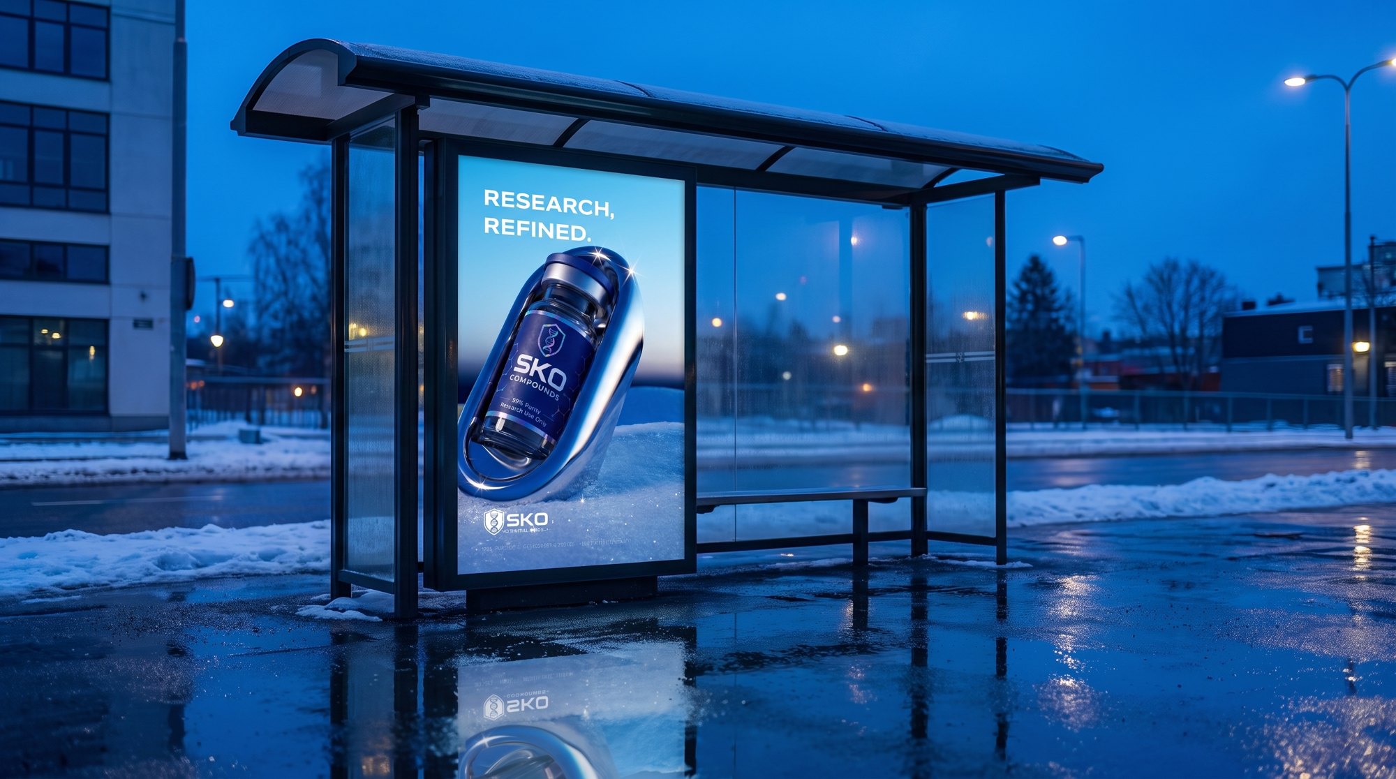 THE STREET · BUS SHELTER
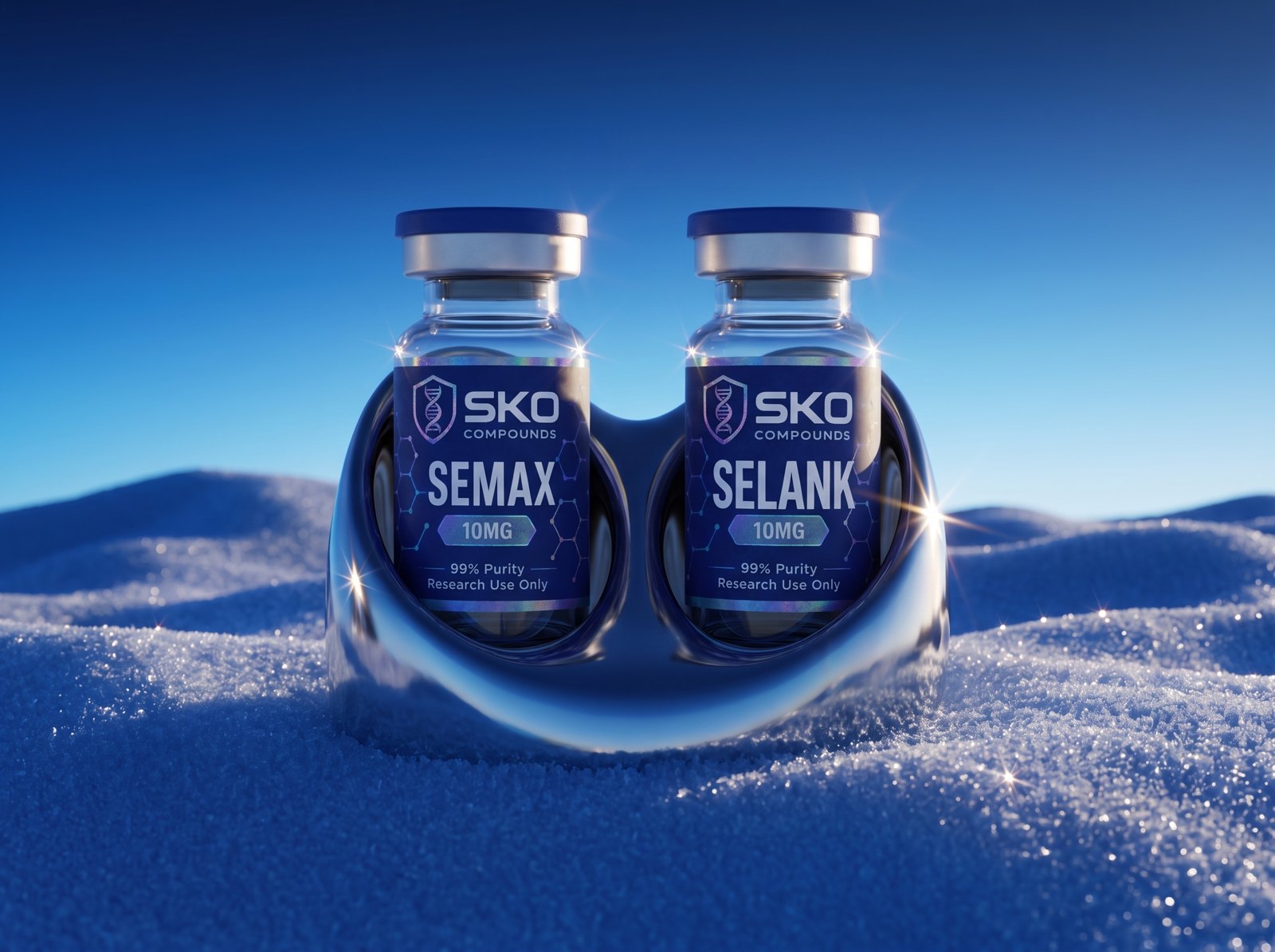 THE MACHINE · TWO SEATS
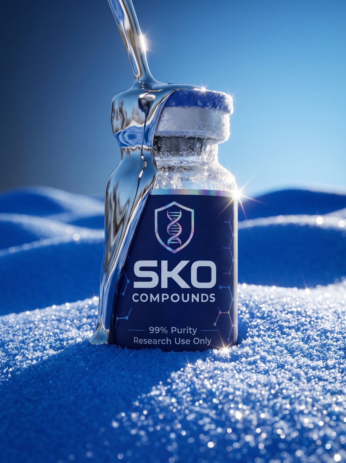 THE AIR · SNOW CHROME
 THE ROAD · BILLBOARD
 SKO BRAND BOOKTHE SYSTEM
Blue is the pigment. Chrome is the machine. The vial is what it holds.
THE AIR IS ALPINE · THE GLINT IS THE SIGNATURE · ONE OBJECT PER FRAMESKO BRAND BOOKTHE SENTENCEThree materials, three roles. The blue is a pigment: dry, matte, absolute, something you pour, dust and carve. The chrome is a machine: a cradle, a badge, a clamp, a turbine, cast and polished like jewellery, never a person. The vial is the only subject, the only thing that is ever photographed.
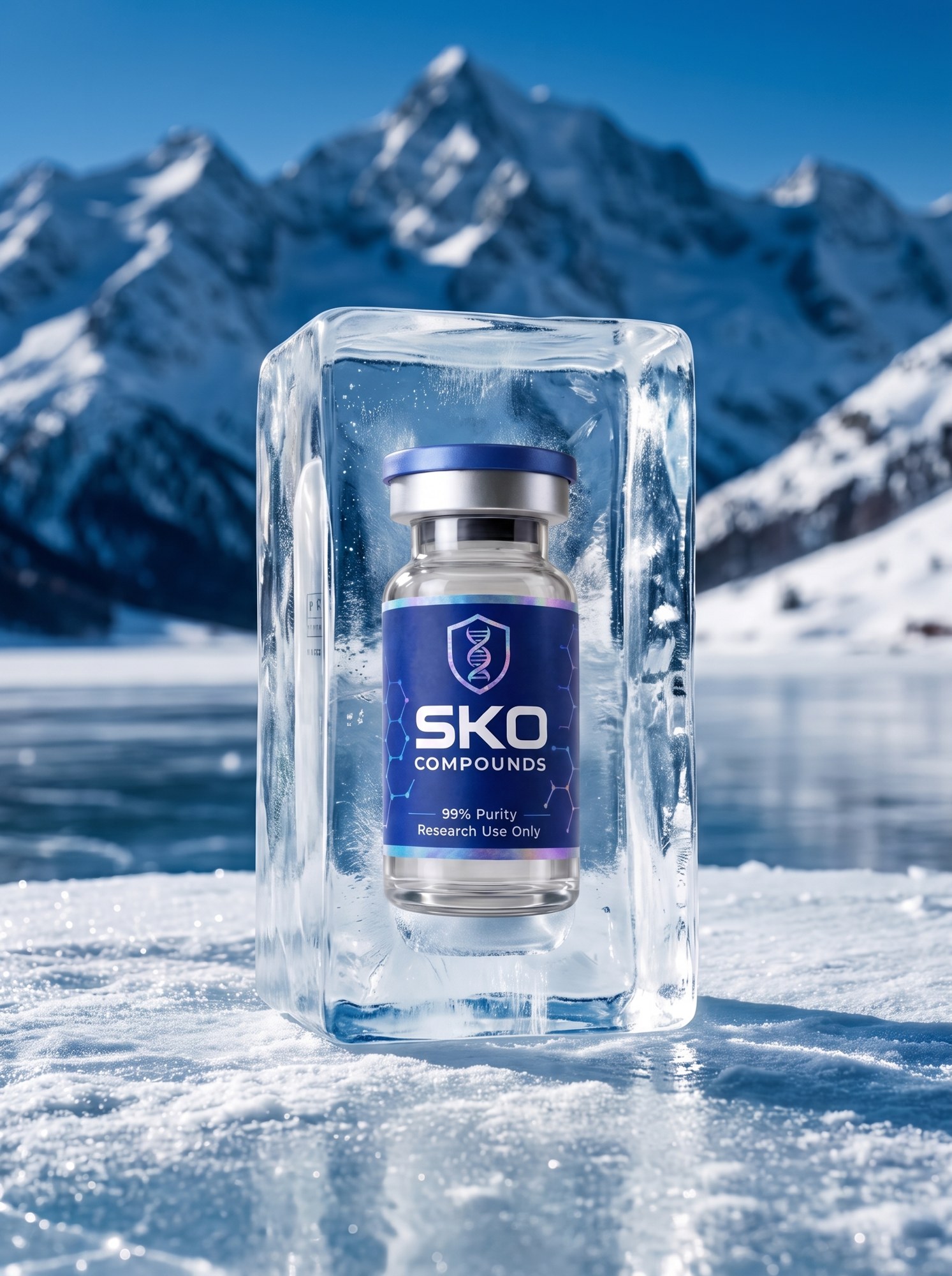
The air is alpine. Snow, ice, frost, a frozen lake, hard mountain sun. Cold and clean. This is what keeps the chrome from becoming a car ad and the blue from becoming a paint chip.
Power comes from stillness. One big object per frame, hard light, flat ground. Not from more objects, more colours or more motion. If a frame has two subjects it has none.
The site follows the book. One object per screen, navy or white, heavy type under it, nothing else. The bright blue is in the pictures, not the chrome of the page.
SKO BRAND BOOKTHE IDEAThree things, in order. The wordmark first: SKO Compounds, the shield and the letters exactly as printed on the label, white on photography, navy on white. Where there is room for the wordmark, the wordmark is used.
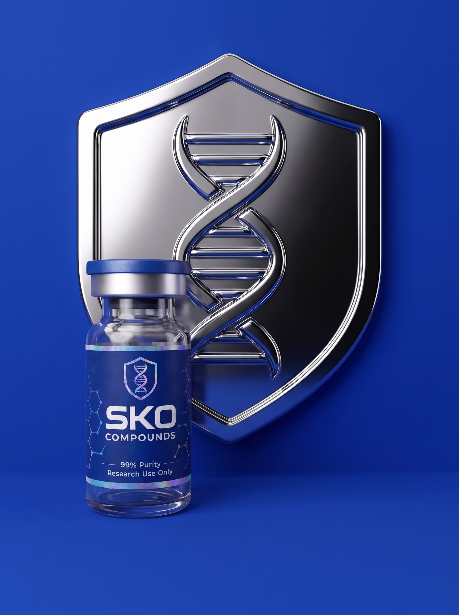
The badge second. The shield with the helix, taken off the label and made into a thing: cast in chrome, pressed into the cap, blind-embossed into the box, foil-stamped on paper, pressed into the pigment. It is the one piece of brand hardware and it is always an object, never a flat print on a coloured ground. With a vial beside it, it is a product shot and lives in the product set.
The flat shield third. Under 48 px and over any image, the shield goes flat and white. It is the only version that is a print rather than an object.
Clear space on all sides equals the shield height.
FIRST · THE WORDMARK · NAVY ON WHITE FIRST · WHITE ON PHOTOGRAPHY AND PIGMENT
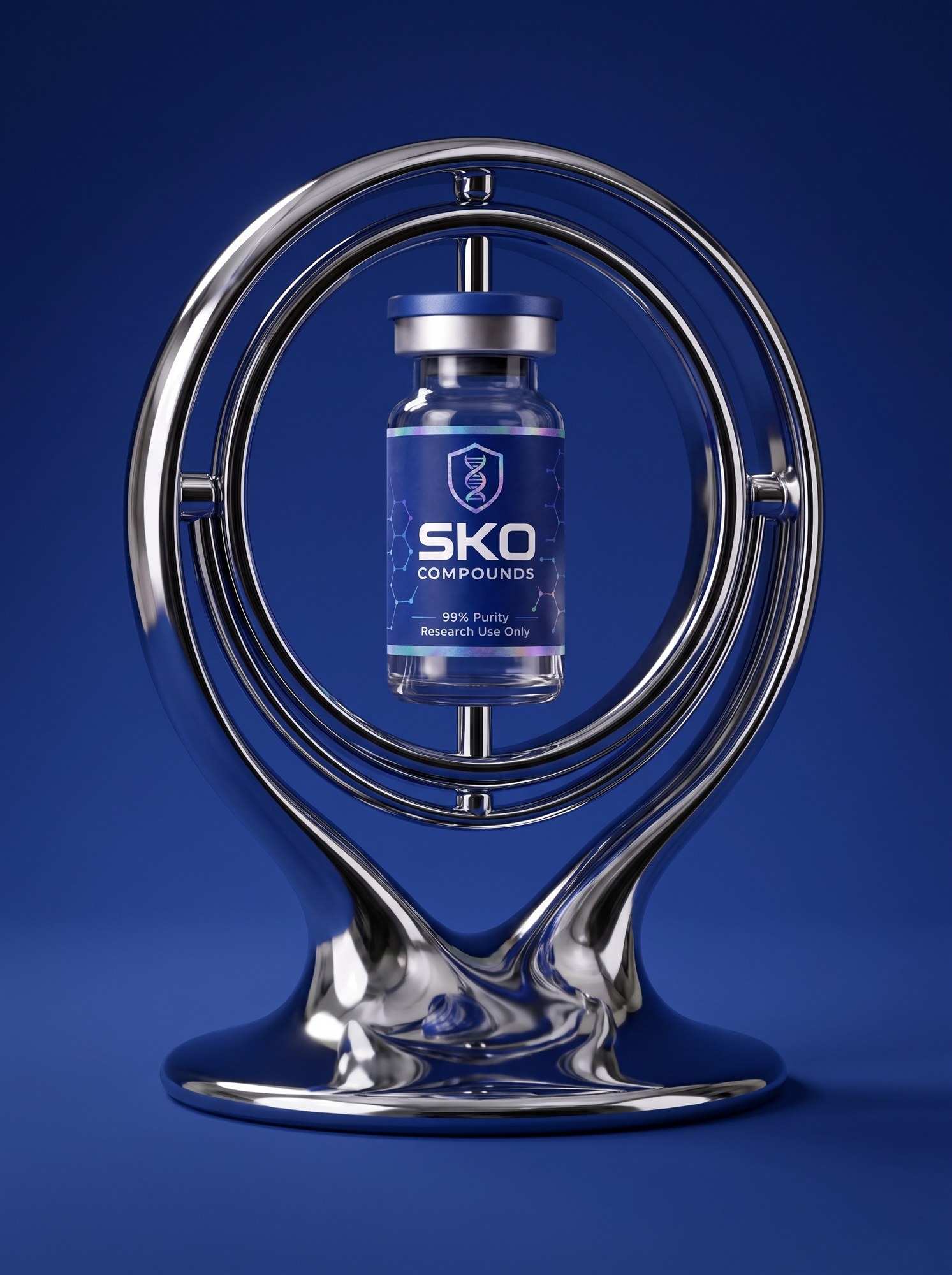
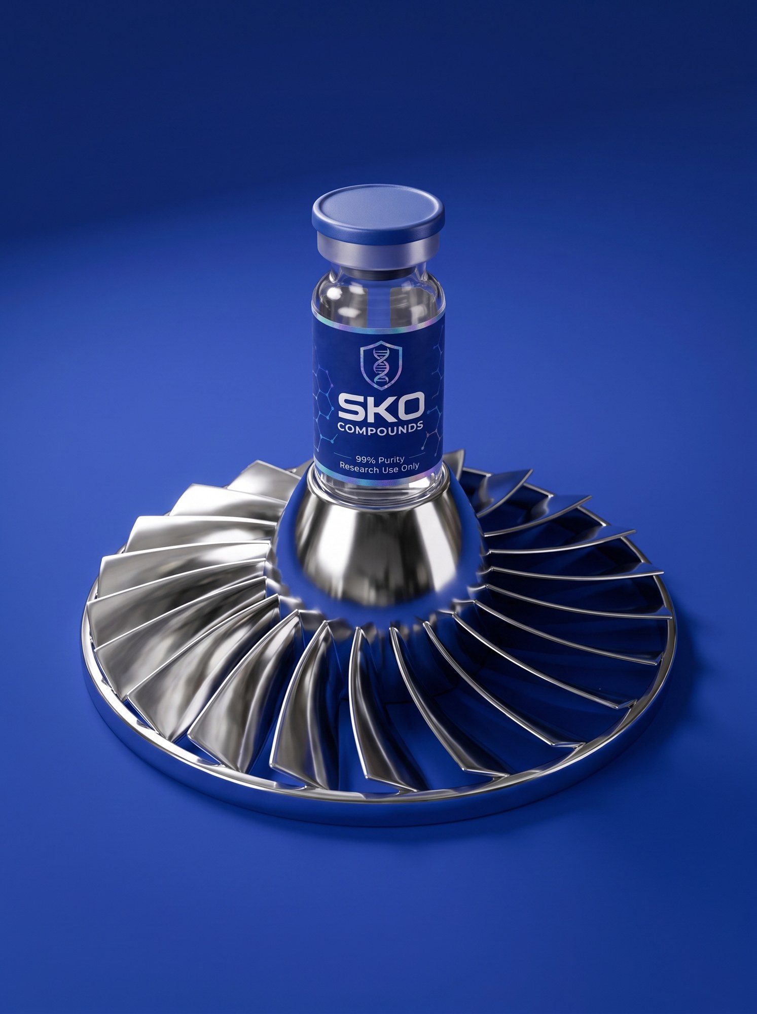
 SECOND · THE BADGE · CAST IN CHROME
 SECOND · PRESSED INTO THE CAP
 SECOND · BLIND-EMBOSSED IN THE BOX
 SECOND · FOIL-STAMPED ON PAPER
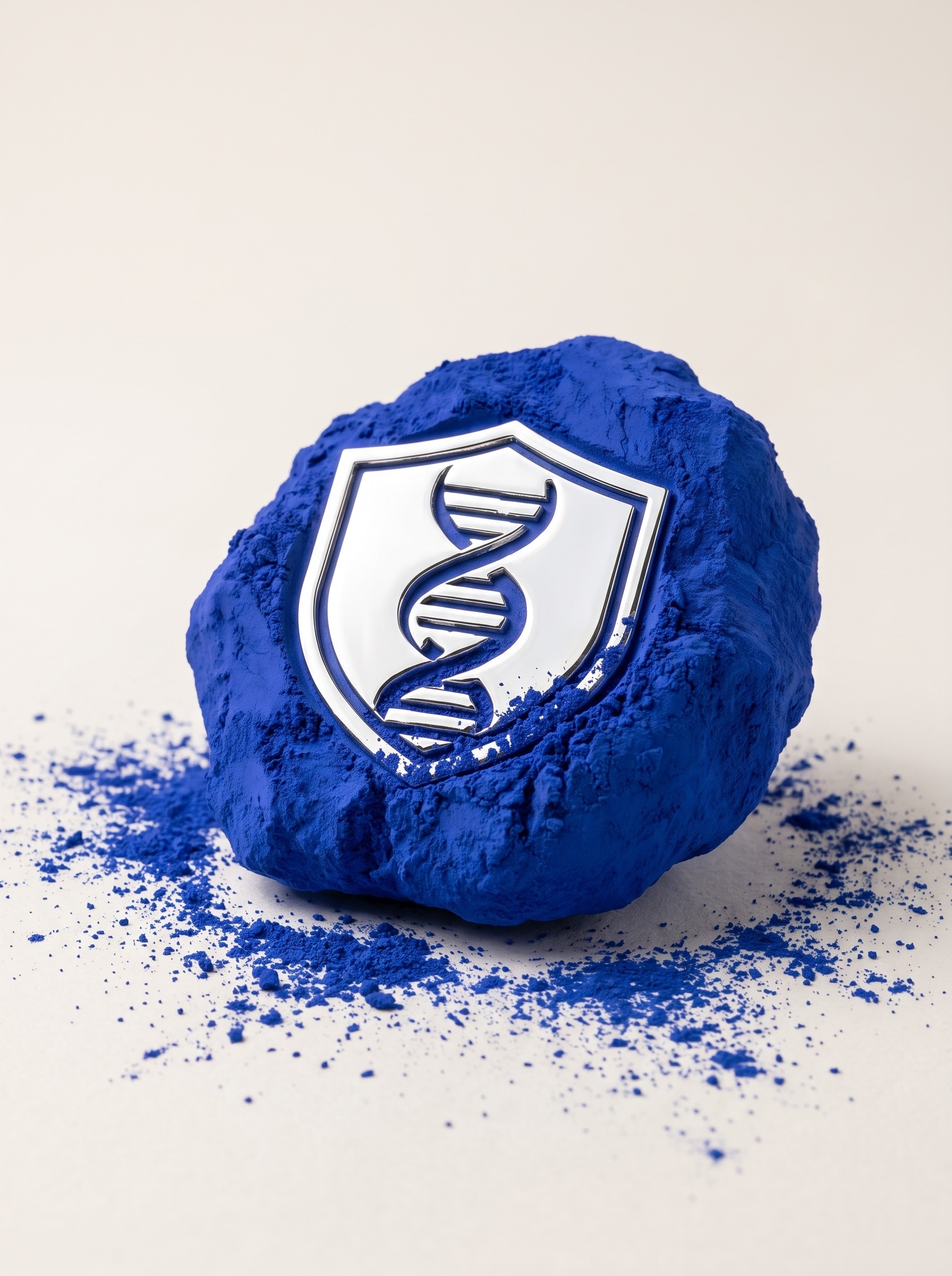 SECOND · PRESSED INTO THE PIGMENTTHIRD · THE FLAT SHIELDUNDER 48 PX · NAVY ON WHITESKO BRAND BOOKIDENTITY
White is the ground. Navy is the type. Blue is a pop. The white studio is where the brand lives: white ground, navy type, frost rules, chrome objects. Navy is the label's measured blue, #173384, and on the page it is type, buttons and hairlines, not surfaces. Pigment and Sky are pops: a tag, a link, a glint, the block under a vial. Used as a page colour they look cheap, so they are never a page colour. Ink is the shadow blue for the hood and the dark set. Frost is the one pale blue, for rules and highlights.
Chrome is not a colour. It is white to Frost with a trace of Pigment in its shadows. That trace is what makes a white frame SKO and not a stock photo.
The hierarchy folds down from white. White studio with chrome. White studio with snow and a hint of blue. White studio with blues. Only then the blue grounds, and those are pictures, never pages. The site is white screens with blue in the photographs; a blue screen is the exception and it has to earn it.
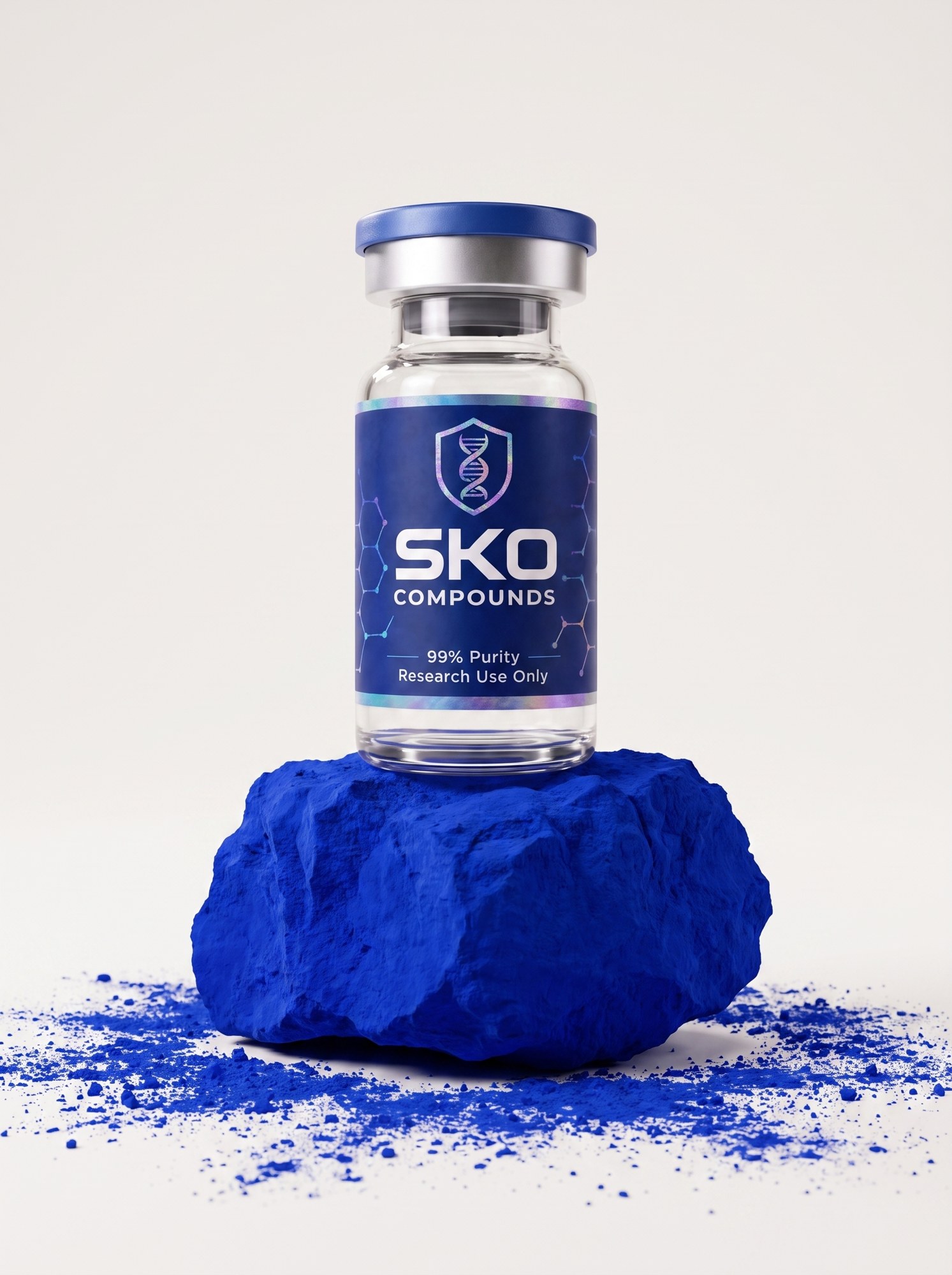
Paper is the off-white for text pages and the rock shot.
Order of use: white, navy, frost, chrome, then pigment and sky in pops. Paper #EFEEEC stays for text pages.
The type, the buttons, the hairlines. The label's own blue. Not a surface.
A pop. One tag, one link, one block under a vial. Never a page colour.
Shadow blue. The hood, the dark set, type on Frost.
The lit blue, in the pictures only. Alpine sky, the frost burst.
Rules, captions, highlights. Never a fill.
The machine. Always reflecting the ground.
The ground. The studio. Where the brand lives.
SKO BRAND BOOKCOLOURWide and squared, like the wordmark. Syncopate Bold is the display face: an extended geometric in the Eurostile family, the Swiss space-age face, which is also where the SKO letters come from. Caps only, set big and left, white on Pigment or Ink on white. No tracking beyond its own width, no outlines, no gradients, no italics.
Inter carries everything that has to be read: body, captions, labels, the site.
JetBrains Mono is the hood. Readouts, batch numbers, the Array, anything that is data. It is the only place the brand is allowed to look like a machine in type.
Display is caps, never mixed case, and never smaller than 48 px on a 350 px slot. If it has to be small or lowercase, it is Inter.
SKO
COMPOUNDS
SYNCOPATE BOLD · CAPS · WHITE ON PIGMENT · LEFT
Research, refined.
BPC-157 · 10 mg
Research-grade compounds, verified by third-party analysis, shipped cold from Los Angeles.
SKO BRAND BOOKTYPEThere is one line. “Research, refined.” It is the only tagline. Everything else on a screen is either the name of a thing, a number, or a plain sentence that helps someone buy.
This book is full of instructions. Shot orders, grounds, framing rules, the running order of a carousel. Those are written for the people making the work. None of them is copy. If a phrase in here tells you how to do something, it never appears in front of a customer.
A note that leaked. “Chrome first, snow second” is the order the two favourite frames run in a carousel. It was set in display type on a moodboard, so it was read as a tagline and printed across a live homepage. That is the whole risk in one sentence: production notes look like copy when they are set like copy.
Bold openers are not lines either. Every paragraph in this book starts with a bold phrase that opens the section: "The air is alpine", "Chrome is not a colour", "Power comes from stillness". They are marked data-role="section-lead". They read like slogans and they are not slogans.
Every caption in this book is a production note. They name shots and sets: the device, the cradle, the drip, alpine, frost, glow. They are marked data-role="production-note" in the markup. None of them is a product name, a collection or a line of copy.
Approved on a screen: the wordmark; “Research, refined.”; product names; form, dose and purity; price; “Research use only”; the hood readout; plain buttons that say what happens.
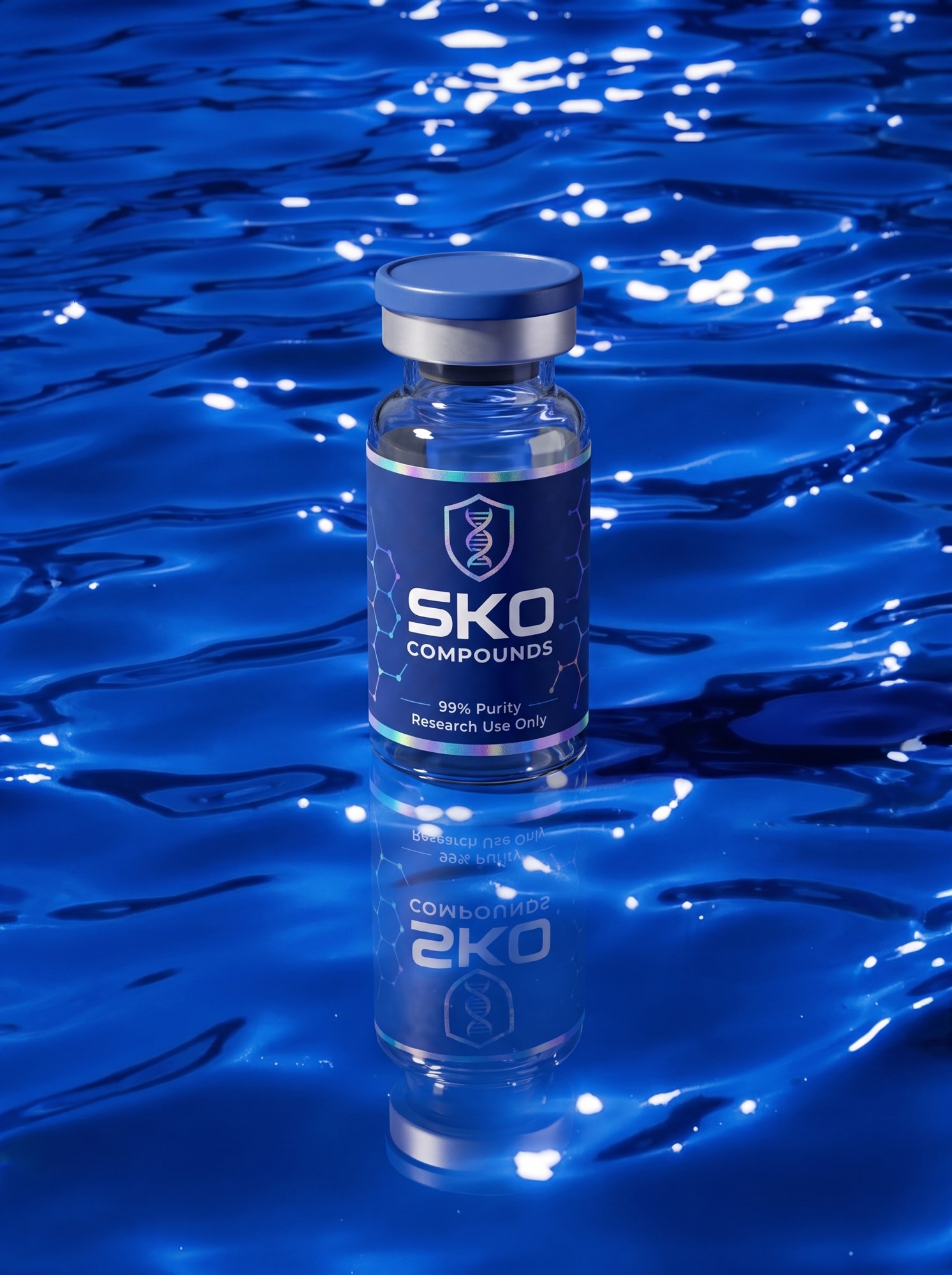
SKO BRAND BOOKWORDSWhite studio first. The hierarchy: white studio with chrome; white studio with snow and a hint of blue; white studio with blues; and then, for the pictures only, the blue grounds: pigment powder, blue water, blue-lit snow, the frost burst, alpine ice, Paper with a pigment rock. Every product shot stands on one of these. Nothing else is a ground.
The blue grounds are photographs, not pages. They carry the alpine air into the book and the carousel; they never become the colour of a screen. Frost is the sleekest frame in the set and the one that says altitude in half a second. Alpine is the only ground with a horizon, and the only one shot outdoors.
Water is hard sun, caustics, a broken reflection. Snow is dusk. Paper is the only light ground, and the pigment always comes with it.
Wet stays optional. Water and frost are the two places it is expected.
SKO BRAND BOOKGROUNDSThe site is white. Pure white, seamless, soft grey contact shadow, one soft key from the upper left. Nothing else in the frame. It is where the vial is quietest and the chrome is loudest, and it is the ground of every screen, every tile and every text page.
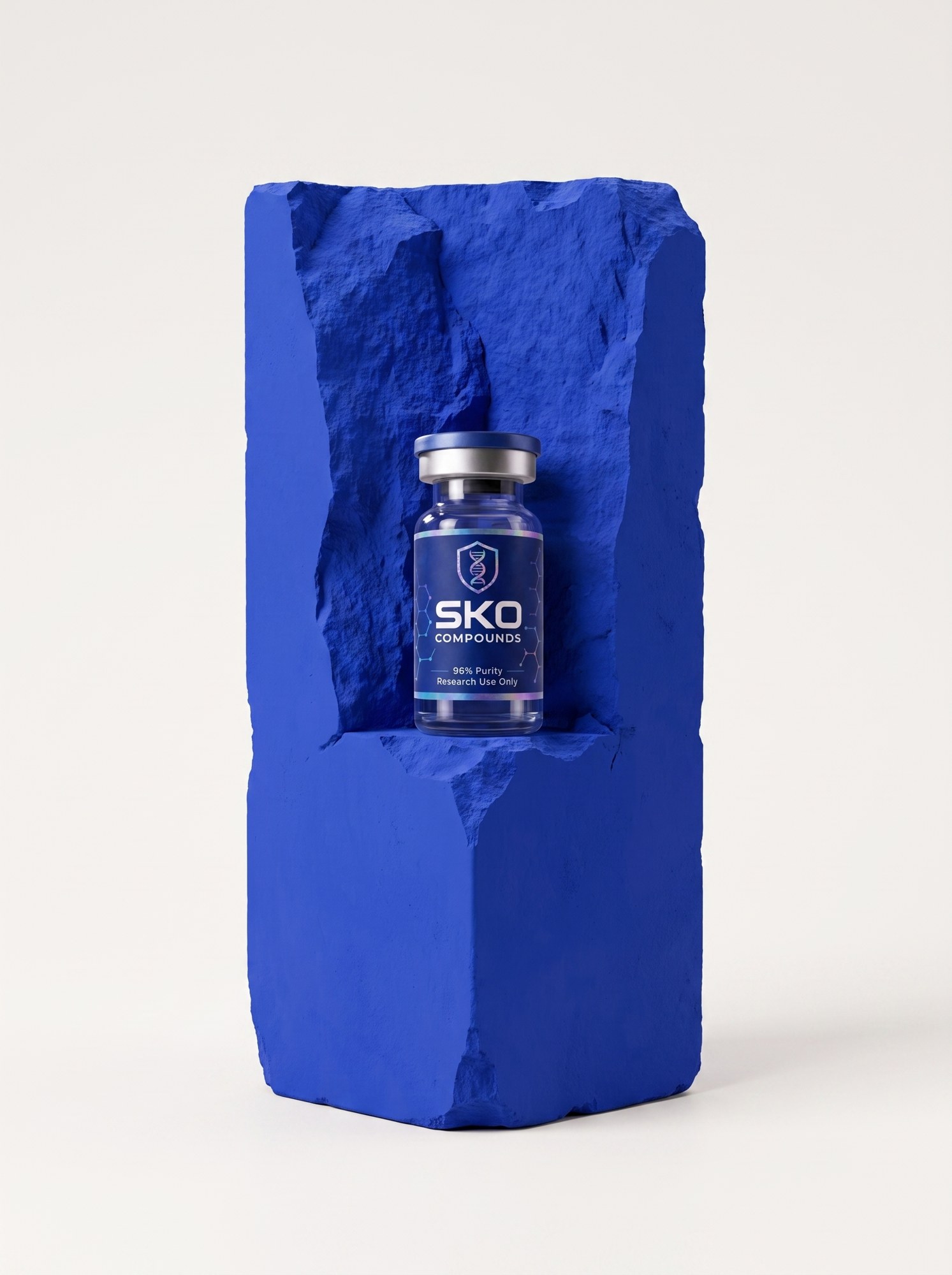
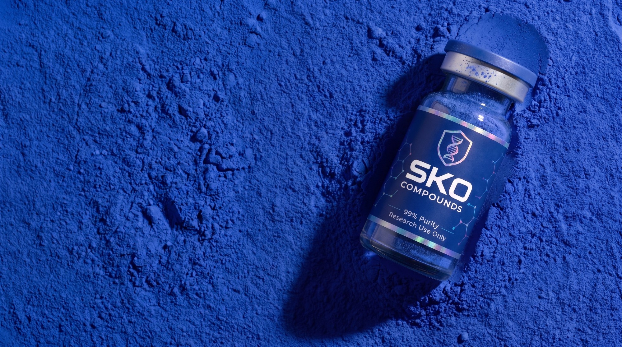
The blue comes with it. On white, the chrome carries a trace of Pigment from off-frame, the pigment block under the vial is the one colour in the picture, and the label is the label. The vial stands on the pigment, never in it. That trace is what makes a white frame SKO and not a stock photo.
The primary lives here. Every SKU has a 1:1 on white, and that is the tile. The 1:1 on Pigment is the flip, the pop, the second frame; it is never the default.
White is never warm, never grey. #FFFFFF, lit flat.
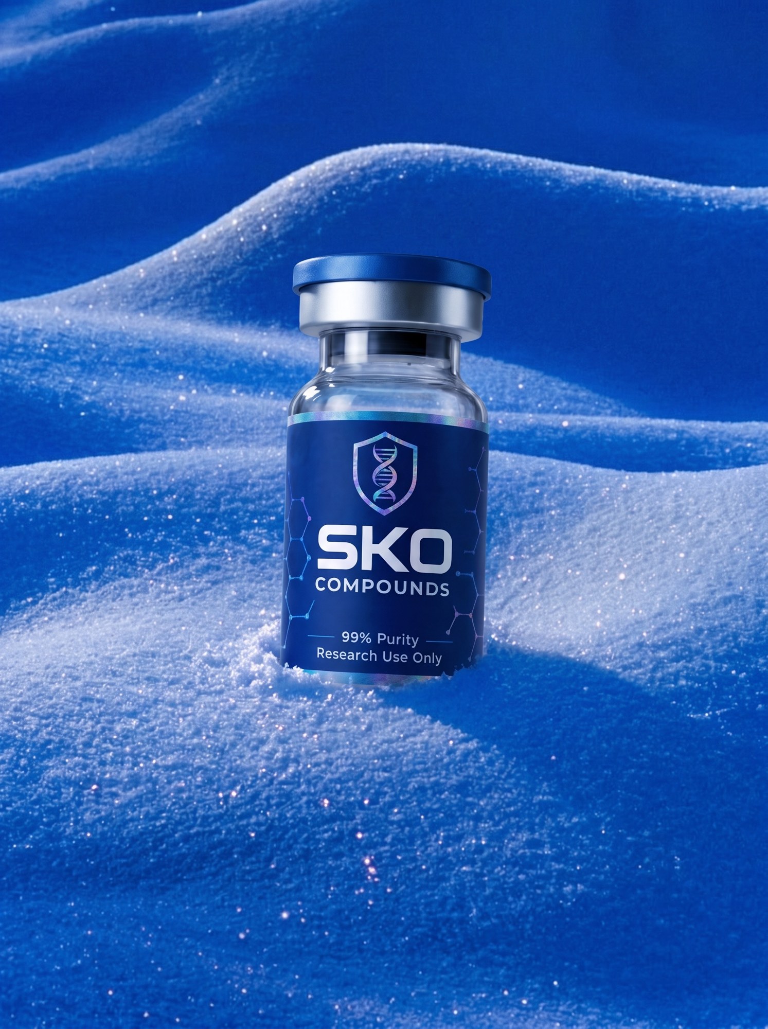
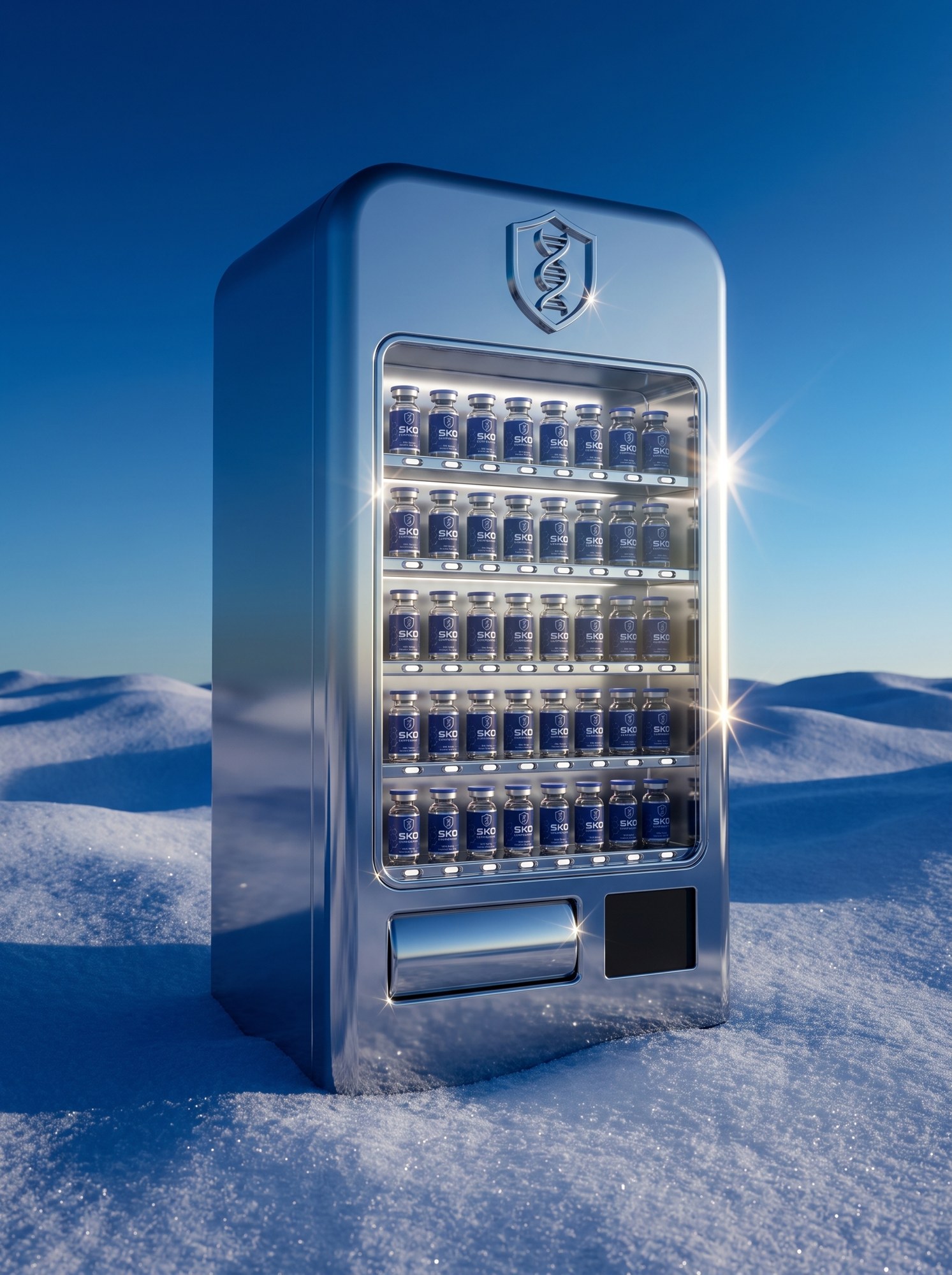
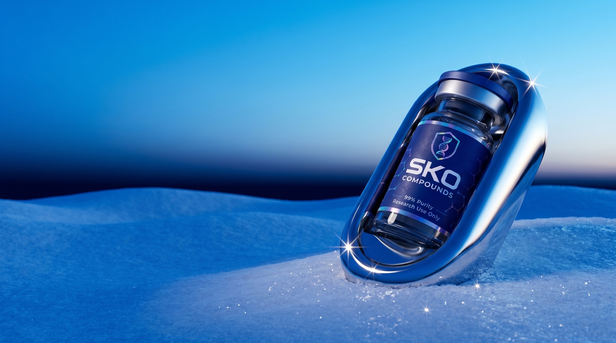
SKO BRAND BOOKWHITEWhere the two halves meet. The chrome machine out in the alpine air. Blue-lit dunes at dusk, a sky that runs Ink at the top to Sky at the horizon, and the chrome reflecting all of it.
The glint is the signature. One hard, low winter sun from the right, throwing small star-shaped speculars off every chrome edge and off the snow crystals. It is the one flourish the brand allows, and it is a lighting decision, never an added sparkle.
Liquid chrome is allowed here. A drip over the cap, a helix drawn out to points. Chrome can flow in the snow; it stays solid and machined on Pigment.
This is the hero world for video. Everything in it moves: snow bursts, chrome pours, the helix rises, the glints travel.
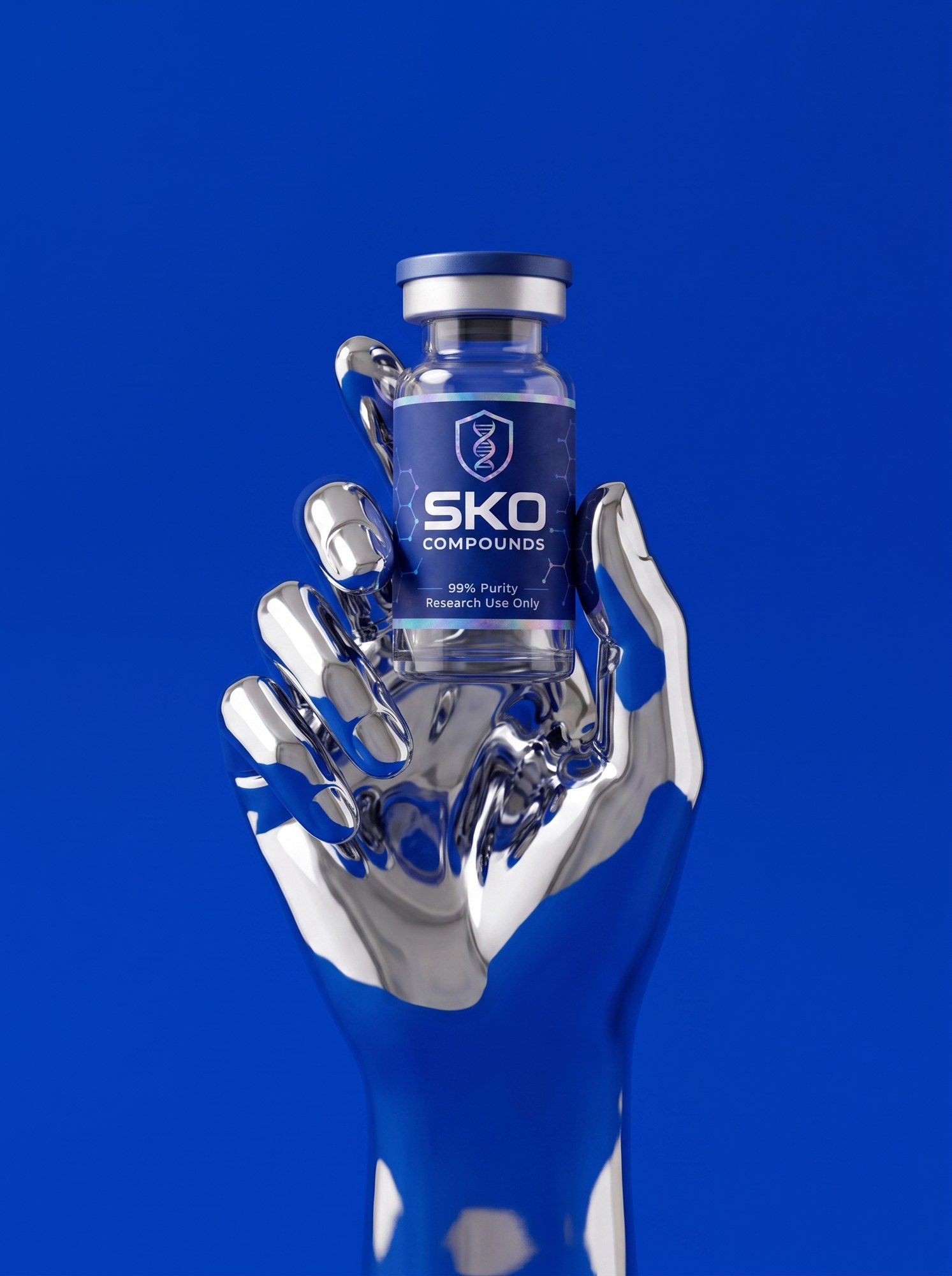
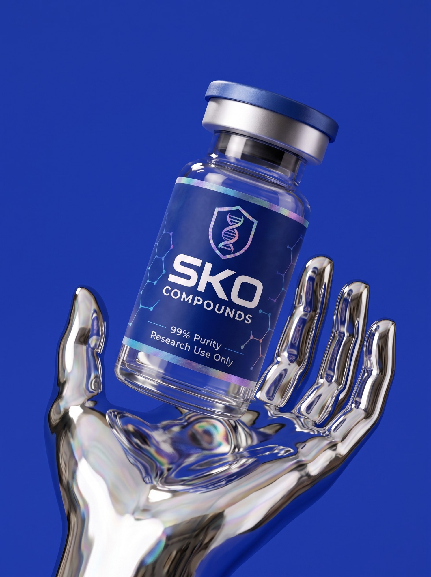
SKO BRAND BOOKSNOW CHROMEThe one figure the brand has. A chrome hand, liquid and seamless, holding a single vial against Pigment. It is not a person and it is not a robot: it is the same chrome the molecule is made of, shaped into the one gesture the brand needs, which is offering the product.
It comes as a pair. The hand holds the vial upright at the fingertips, tight and vertical: that is the poster. The companion is the open palm, the vial resting and tipped, wider and calmer: that is the second frame, the one that breathes. Use them as a pair wherever there is room for two, hand first.
Where it goes. Campaign, paid media, video, the top of a landing page, the cover of a deck. It carries a headline better than any other frame in the book because the vial is held at eye height with nothing behind it.
Where it does not. Never on a product page, never in a grid of products, never next to a second hand or a second vial. One hand, one vial, one frame.
Chrome on Pigment only. No wrist jewellery, no cuff, no figure attached. The vial keeps its printed label.
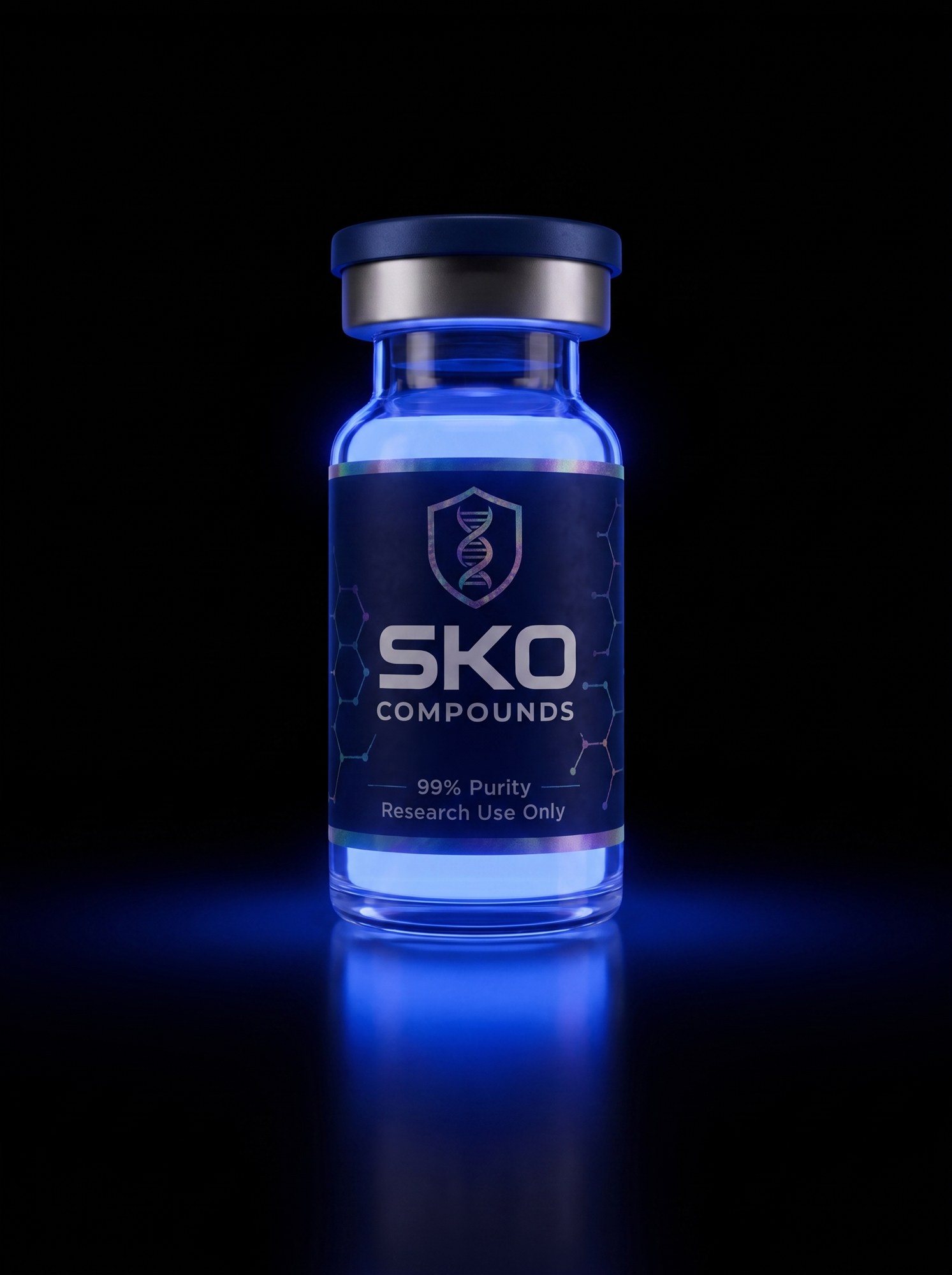
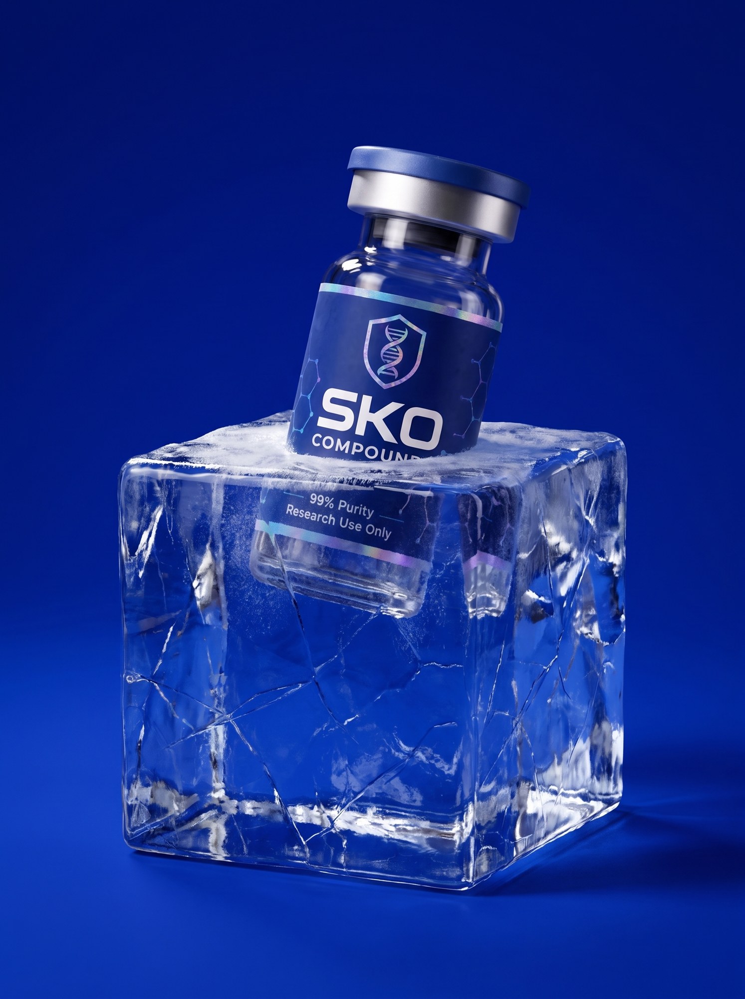
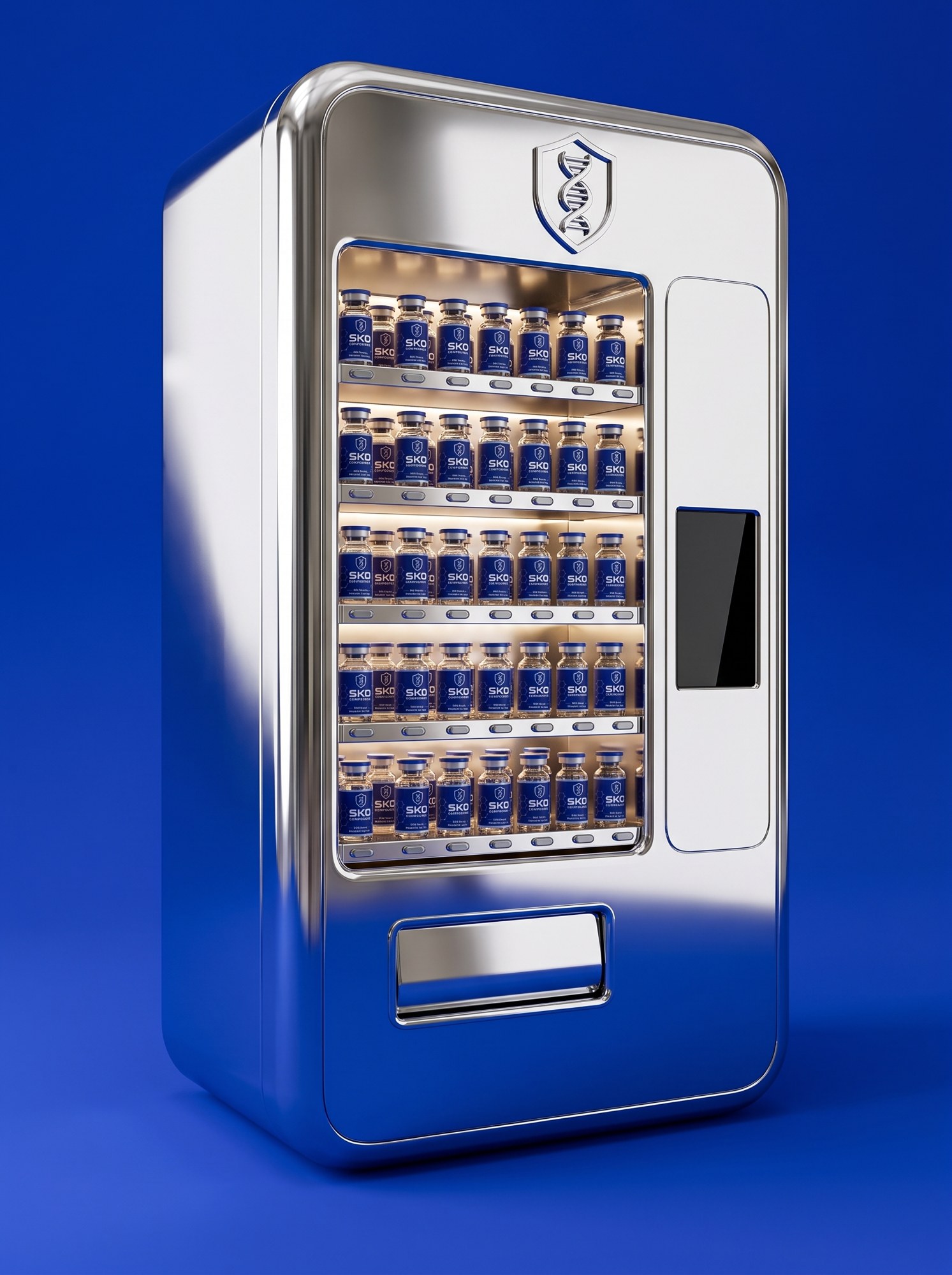
SKO BRAND BOOKTHE HANDFor ads and video, not for the book. Frames where the blue becomes a light and the chrome becomes a body or a set: the liquid glowing inside the glass, the vial frozen in ice, the pigment cliff and the chrome vending machine, which is an ad in itself: the whole catalogue behind glass, one slot, and a story about what comes out of it.
They are louder than the grounds and they earn their place in paid media, where a frame has half a second, and in motion. On the site they are used once, if at all. The hand has its own page before this one. No robots, no figures.
The glow is the liquid, never a halo behind the vial.
SKO BRAND BOOKTHE DARK SETWhere cyber lives. The brand's technical edge is under the surface: mono readouts, the Array, batch data. It is text and data, never imagery. No HUD lines, no grids, no neon, no warp.
Ink ground, Frost text, JetBrains Mono. It reads like an instrument panel and it is the only place the brand is allowed to.
SKO BRAND BOOKTHE HOODEvery SKU gets the same six. The 1:1 primary on Pigment, then chrome in the snow, frost, the primary on white, pigment and water. The two primaries are the card images, Pigment on blue screens, white on white screens; all six are the carousel. Chrome leads because it is the brand's first favourite and snow its second. The dark frame is for ads only.
Sprays use the spray master, bundles slot in as a pairs-with slide. Labels are checked at zoom before anything goes live.
Rendered: 34 SKUs, six shots each, 204 images, every label checked. Gallery: site/compounds.html. Isometrica, each compound's real molecule as a chrome machine in the snow, is the book.
SKO BRAND BOOKPRODUCTSEvery plate in this edition at 2000 px. PNG masters are held with the source files.
SKO BRAND BOOKASSETS